Buttons
Updated in October 2026
Use buttons to help users to complete an action, like starting an application or saving their progress.
<button class="nhsw-button nhsw-button--primary" type="button">Save and continue</button>{% from "button/macro.njk" import nhswButton %}
{{ nhswButton({
  text: "Save and continue",
  classes: "nhsw-button--primary"
}) }}When to use a button
Use buttons when users need to take an action, like:
- submitting a form
- continuing to the next step in a journey
- saving progress
- confirming a choice
- starting a task or application
When not to use a button
Do not use buttons as links. This includes:
- to pages which are not part of your user journey
- from 1 flat content page to another
- to external websites
Try not to have multiple buttons on a page. Follow GOV.UK guidance on structuring forms and starting with 1 thing per page.
How to use a button
Align the primary action button to the left edge of your form. On smaller screens, such as on mobile, buttons stretch across the screen's width.
Button text
Write button text in sentence case, describing the action it performs. For example:
- "Start now" on the start page of your service
- "Log in" to an account a user has already created
- "Continue" whether the service saves or does not save a user's information
- "Save and continue" when the service saves a user's information but your research shows you need to reassure them that it does
- "Save and come back later" when a user can save their information and come back later
- "Add another" to add another item to a list or group
- "Pay" to make a payment
- "Confirm and send" on a check answers page that does not have any legal content a user must agree to
- "Confirm and save" on a check answers page on a staff-facing service where data is not being sent to another person or system
- "Accept and send" on a check answers page that has legal content a user must agree to
- "Log out" when a user is logged in to an account
You may need to include more or different words to better describe the action. For example, "Add another address" and "Accept and book the appointment".
Preventing double clicks
Some users may select a button more than once. This can happen because they:
- are used to double-clicking items
- have a slow connection and do not get feedback quickly enough
- have a motor impairment that causes an unintended second click
In some cases, this can cause information to be submitted more than once.
If research shows this is a problem, you can configure the button to ignore a second click by setting data-prevent-double-click attribute to true, you can do this directly in the HTML.
This only prevents double clicks when JavaScript is enabled. You should also prevent duplicate submissions on the server side.
For slow connections, give users clear feedback that something is happening before preventing double clicks, for example by showing a loading indicator.
Accessibility
Make sure all users can see the button. The background colour must have a contrast ratio of at least 3:1 with white. This supports WCAG 2.2 Success Criterion 1.4.11 Non-text Contrast, level AA.
Do not rely on colour alone to convey meaning. Use clear text labels so all users can understand the purpose of a button, regardless of how they perceive colour. This supports WCAG 2.2 Success Criterion 1.4.1 Use of Colour, level A.
Do not decrease the height or clickable area of buttons. Larger touch targets help users select buttons accurately. This supports WCAG 2.2 Success Criterion 2.5.8 Target Size, level AA.
Source
Learn more about Buttons in the GOV.UK Design System.
Button variants
Primary buttons
<button class="nhsw-button nhsw-button--primary" type="button">Save and continue</button>{{ nhswButton({
text: "Save and continue",
classes: "nhsw-button--primary"
}) }}Use a primary button for the main action on a page, for example to start an application, continue to the next step or save information.
Use only 1 primary button on a page. More than 1 can make it harder for users to understand what they should do next.
Secondary buttons
<button class="nhsw-button nhsw-button--outline" type="button">Continue</button>{{ nhswButton({
text: "Continue",
classes: "nhsw-button--outline"
}) }}Use a secondary button for an action that is less important than the primary action on the page. You can also use 1 for an optional action that users do not need to complete to continue. Examples include:
- save a draft
- change your answers
- print this page
Too many actions on a page can make it harder for users to know what to do next. Before adding several secondary buttons, consider simplifying the page or splitting the journey into separate steps.
Exception buttons
<button class="nhsw-button nhsw-button--exceptional" type="button">Override process</button>{{ nhswButton({
text: "Override process",
classes: "nhsw-button--exceptional"
}) }}Use an exception button for an action that is only needed in an unusual situation or when something has gone wrong. Examples include:
- report an issue
- record an exception
- escalate for review
Warning buttons
<button class="nhsw-button nhsw-button--warning" type="button">Archive record</button>{{ nhswButton({
text: "Archive record",
classes: "nhsw-button--warning"
}) }}Use a warning button for an action that has serious consequences and cannot easily be undone, for example permanently deleting an account or record.
Use warning buttons sparingly. Most services should not need one.
For destructive actions, ask users to confirm before completing the action. Use another button style for the initial action and a warning button for the final confirmation.
Do not rely on the red colour alone to show that an action is destructive. This is because not all users will be able to see the colour or understand what it means. Use clear button text and supporting content to explain what will happen.
Small delete buttons
<button class="nhsw-button nhsw-button--warning-outline nhsw-button--small" type="button">Delete</button>{{ nhswButton({
text: "Delete",
classes: "nhsw-button--warning-outline nhsw-button--small"
}) }}Use a small delete button for a lower-emphasis destructive action where space is limited, such as deleting an item from a list or table.
Use a warning button instead when the destructive action has serious consequences or cannot easily be undone.
Smaller buttons
<div class="nhsw-button-group">
<button class="nhsw-button nhsw-button--primary nhsw-button--small" type="button">Update results</button>
<button class="nhsw-button nhsw-button--secondary nhsw-button--small" type="button">Clear filters</button>
</div>{{ nhswButton({ text: "Update results", classes: "nhsw-button--primary nhsw-button--small" }) }}
{{ nhswButton({ text: "Clear filters", classes: "nhsw-button--secondary nhsw-button--small" }) }}Use small buttons sparingly. Use a standard button by default.
Only use a small button when:
- space is limited, for example in a card or panel
- users have several actions of similar importance to choose from, for example in a staff-facing service
Keep buttons in a group the same size. Do not place a small button and a standard button in the same group.
Use only 1 primary button in a group so it is clear which is the main action.
Button styled as a link
<div class="nhsw-button-group">
<button class="nhsw-button nhsw-button--outline" type="button">Continue</button>
<button class="nhsw-button nhsw-button--link nhsw-button--reverse" type="button">Cancel</button>
</div><div class="nhsw-button-group">
{{ nhswButton({
  text: "Continue",
  classes: "nhsw-button--outline"
}) }}
{{ nhswButton({ text: "Cancel", classes: "nhsw-button--link nhsw-button--reverse" }) }}
</div>Buttons can be styled as links. However, you should avoid using these, except if:
- all other button types would be too visually prominent
- the user is being taken to another page to perform an action
When to use a button versus a hyperlink
You should use a:
- button when the user is performing an action (either primary or secondary)
- standard hyperlink when the user is navigating to a different webpage, for example, to find out more about a topic on 111 Wales
Grouping buttons
<div class="nhsw-button-group">
  <button class="nhsw-button nhsw-button--primary" type="button">Continue</button>
  <button class="nhsw-button nhsw-button--secondary" type="button">Save and come back later</button>
</div>
{{ nhswButton({ text: "Continue", classes: "nhsw-button--primary" }) }}
{{ nhswButton({ text: "Save and come back later", classes: "nhsw-button--secondary" }) }}Use a button group when 2 or more buttons are placed together. The buttons will display side by side on wider screens. On smaller screens, such as on mobile, they'll appear above each other.
Examples
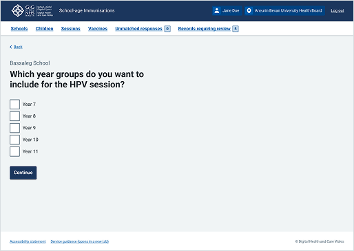
Welsh Immunisation System (WIS)
This example is from the School-age Immunisations service within WIS. It shows a "Continue" button used as the primary action on a form. The button appears after all form fields and moves the user to the next step.
Choose Pharmacy
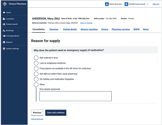
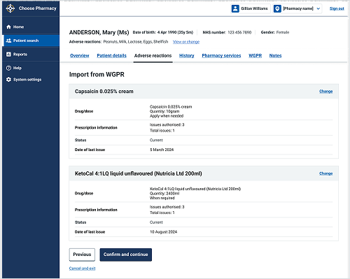
This example shows a page from the Choose Pharmacy service with 3 actions:
- "Save and continue" to move forwards in the process (primary action)
- "Previous" to go back a step (secondary action)
- "Cancel and exit" to leave the journey (button styled as a link)
The actions are grouped to support clear and predictable navigation.