Panel
Updated in October 2026
Use the panel component to draw attention to important outcomes, such as a completed task, reference number or result.
Application complete
HDJ2123F
<div class="nhsw-panel">
  <svg class="nhsw-panel__icon" viewBox="0 0 24 24" focusable="false" aria-hidden="true">
    <path d="M4 12l5 5L20 6" />
  </svg>
  <h1 class="nhsw-panel__title">Application complete</h1>
  <div class="nhsw-panel__body">
    Your reference number<br>
    <strong>HDJ2123F</strong>
  </div>
</div>
{% from "panel/macro.njk" import nhswPanel %}
{{ nhswPanel({
titleText: "Application complete",
html: "Your reference number<br><strong>HDJ2123F</strong>"
}) }}When to use a panel
Use a panel to:
- highlight that users have done something successfully
- display important information when a transaction has been completed
In most cases, the panel component is used on confirmation pages, to tell the user they have successfully completed the transaction.
When not to use a panel
Never use the panel component to highlight important information in body content. Instead consider using:
How to use a panel
A panel is made up of:
- a heading that confirms what has happened
- description text, which is optional
How to write panel text
Keep your panel heading text brief. It only needs to summarise what has happened. For example, "Application complete".
Use short words and phrases to make sure highlighted information is easy to read at different screen sizes. Shorter text is less likely to wrap around the panel, which can happen when using the zoom function on mobiles.
If the panel heading needs to be longer, you can reduce the text size by adding the nhsw-panel__title--l class or setting the titleSize: "l" Nunjucks macro option.
You can add more context or details by using additional text under the heading.
Accessibility
Keep text short and concise to ensure it remains fully readable at all zoom levels, including when users apply browser or mobile device zoom. Content must not clip, overlap, truncate or become obscured when users zoom the page or resize text. This supports WCAG 2.2 Success Criterion 1.4.4 Resizing Text, level AA.
Do not rely on colour alone to convey meaning. Use a clear heading so all users can understand the purpose of a panel, regardless of how they perceive colour. This supports WCAG 2.2 Success Criterion 1.4.1 Use of Colour, level A.
Source
Learn more about Panels in the GOV.UK Design System.
Panel variants
Smaller panel
Application complete
HDJ2123F
<div class="nhsw-panel nhsw-panel--small">
  <svg class="nhsw-panel__icon" xmlns="http://www.w3.org/2000/svg" viewBox="0 0 24 24" focusable="false" aria-hidden="true">
    <path d="M4 12l5 5L20 6" />
  </svg>
  <h1 class="nhsw-panel__title">Application complete</h1>
  <div class="nhsw-panel__body">
    Your reference number<br>
    <strong>HDJ2123F</strong>
  </div>
</div>
{{ nhswPanel({
titleText: "Application complete",
html: "Your reference number<br><strong>HDJ2123F</strong>",
classes: "nhsw-panel--small"
}) }}Use a smaller panel when space is limited. It offers a more compact alternative to a standard panel.
Panel without icon (large)
Application complete
HDJ2123F
<div class="nhsw-panel">
  <h1 class="nhsw-panel__title">Application complete</h1>
  <div class="nhsw-panel__body">
    Your reference number<br>
    <strong>HDJ2123F</strong>
  </div>
</div>
{{ nhswPanel({
titleText: "Application complete",
icon: false,
html: "Your reference number<br><strong>HDJ2123F</strong>"
}) }}Use a panel without an icon when you need to highlight information without indicating a specific status, such as success, warning or error.
Panel without icon (small)
Application complete
HDJ2123F
<div class="nhsw-panel nhsw-panel--small">
  <h1 class="nhsw-panel__title">Application complete</h1>
  <div class="nhsw-panel__body">
    Your reference number<br>
    <strong>HDJ2123F</strong>
  </div>
</div>
{{ nhswPanel({
titleText: "Application complete",
html: "Your reference number<br><strong>HDJ2123F</strong>",
icon: false,
classes: "nhsw-panel--small"
}) }}Use a smaller panel when space is limited or the content needs less prominence than a standard panel. It does not include an icon, making it suitable for general information and guidance.
Examples
Welsh Immunisation System (WIS)
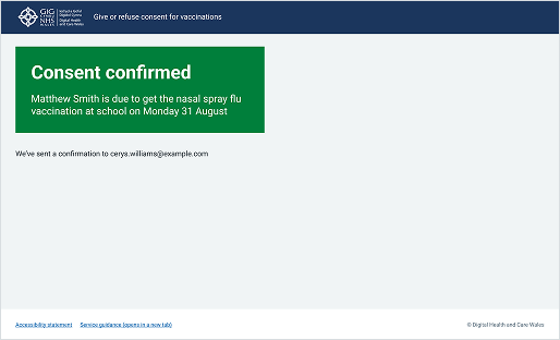
This example shows a confirmation page from the public-facing section of the School-age Immunisations service within WIS. It uses a solid green panel to reassure parents or guardians that their action was successful.
Choose Pharmacy
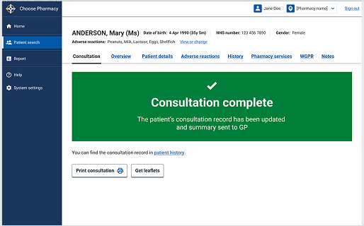
This example shows the final screen of a clinical workflow within the Choose Pharmacy service. It uses a solid green panel to give clinicians immediate clarity at the end of a consultation.