Cards
Updated in October 2026
Use a card to visually group related content and actions to help users do what they need to more quickly.
<div class="nhsw-card">
  <span class="nhsw-card__stat">10</span>
  <a class="nhsw-card__title-link" href="/applicants">Applicants</a>
</div>
{% from "card/macro.njk" import nhswCard %}
{{ nhswCard({
stat: "10",
title: "Applicants",
titleHref: "/applicants"
}) }}When to use cards
Use a card to give users a brief summary of content or a task, often with a link to more detail. You can display a card alongside other cards to group related content or tasks.
Use clickable cards to signpost groups of related content and help users find what they need.
You can use a basic, non-clickable card on content pages to provide some visual structure. It may help users scan information more easily.
When not to use cards
Do not use a card to highlight content on a page of long form content.
Before using a card, consider using:
- the care card pattern to help users decide when and where to get care
- details
- an expander
- inset text
- tabs
- a warning callout
How to use cards
Make cards easy to scan for relevant and actionable information.
You can include multiple elements, such as a title, text, an image and links. If you include a link, the link should mirror the heading of the page it links to.
Accessibility
Heading level and size
Use headings correctly to reflect the page structure. Learn more about how to use headings correctly in the NHS England Design System.
If you need to, change the level of the heading. This supports WCAG 2.2 Success Criterion 1.3.1 Info and Relationships, level A.
Here's an example of replacing the default l (or h2) heading with an m (or h3).
Heading level m
Card description text goes here.
<div class="nhsw-card">
  <h3 class="nhsw-card__title nhsw-card__title--m">Heading level m</h3>
  <p class="nhsw-card__description">Card description text goes here.</p>
</div>
{{ nhswCard({
title: "Heading level m",
headingLevel: 3,
titleSize: "m",
description: "Card description text goes here."
}) }}You can change the size of the heading using heading typography styles.
Heading level l
Card description text goes here.
Heading level m
Card description text goes here.
Heading level s
Card description text goes here.
<div class="nhsw-card">
<h2 class="nhsw-card__title nhsw-card__title--l">Heading level l</h2>
<p class="nhsw-card__description">Card description text goes here.</p>
</div>
<div class="nhsw-card">
<h3 class="nhsw-card__title nhsw-card__title--m">Heading level m</h3>
<p class="nhsw-card__description">Card description text goes here.</p>
</div>
<div class="nhsw-card">
<h4 class="nhsw-card__title nhsw-card__title--s">Heading level s</h4>
<p class="nhsw-card__description">Card description text goes here.</p>
</div>{{ nhswCard({
title: "Heading level l",
headingLevel: 2,
titleSize: "l",
description: "Card description text goes here."
}) }}
{{ nhswCard({
  title: "Heading level m",
  headingLevel: 3,
  titleSize: "m",
  description: "Card description text goes here."
}) }}
{{ nhswCard({
title: "Heading level s",
headingLevel: 4,
titleSize: "s",
description: "Card description text goes here."
}) }}Source
Learn more about Cards in NHS England Design System.
Follow discussions about Cards on NHS England GitHub to see the latest updates and resolved issues.
Cards variants
Clickable cards
Top task card
Manage appointments
View, change or cancel your upcoming appointments.
<div class="nhsw-card">
  <h3 class="nhsw-card__title"><a class="nhsw-card__title-link" href="/appointments">Manage appointments</a></h3>
  <p class="nhsw-card__description">View, change or cancel your upcoming appointments.</p>
</div>
{{ nhswCard({ title: "Manage appointments", titleHref: "/appointments", description: "View, change or cancel your upcoming appointments." }) }}<div class="nhsw-card nhsw-card--top-task">
<h3 class="nhsw-card__title"><a class="nhsw-card__title-link" href="/repeat-prescription">Order a repeat prescription</a></h3>
</div>{{ nhswCard({ title: "Order a repeat prescription", titleHref: "/repeat-prescription", classes: "nhsw-card--top-task" }) }}Use top task cards to help users quickly access important information or common tasks.
Place them near the top of a page, above other cards or navigation options.
Only use top task cards for content or services that users need most often. They should provide a clear shortcut to high-priority information.
Use no more than three top task cards on a page.
Card with chevron
Manage appointments
View, change or cancel your upcoming appointments.
<div class="nhsw-card nhsw-card--chevron">
  <h3 class="nhsw-card__title"><a class="nhsw-card__title-link" href="/appointments">Manage appointments</a></h3>
  <p class="nhsw-card__description">View, change or cancel your upcoming appointments.</p>
</div>
{{ nhswCard({ title: "Manage appointments", titleHref: "/appointments", description: "View, change or cancel your upcoming appointments.", classes: "nhsw-card--chevron" }) }}The chevron icon helps users know the card will take them to more content. The size of the card helps these links be more frequently noted or more important than other topics signposted by secondary links.
There is only a clickable version of this card.
Card with an icon
Manage appointments
View, change or cancel your upcoming appointments.
<div class="nhsw-card">
  <h3 class="nhsw-card__title">
    <span class="nhsw-card__icon" aria-hidden="true">i</span>
    <a class="nhsw-card__title-link" href="/appointments">Manage appointments</a>
  </h3>
  <p class="nhsw-card__description">View, change or cancel your upcoming appointments.</p>
</div>
{{ nhswCard({ title: "Manage appointments", titleHref: "/appointments", description: "View, change or cancel your upcoming appointments.", icon: true }) }}Use a card with an icon when you help users quickly recognise a category, action or type of content by sight. Icons support scanning and can make it easier for users to differentiate between similar topics. Always pair icons with clear labels — icons should support understanding, not replace it.
Do not use icons if:
- the icon does not clearly represent the content
- the icon adds unnecessary noise or competes with more important content
Card with a stat
<div class="nhsw-card">
  <span class="nhsw-card__stat">10</span>
  <a class="nhsw-card__title-link" href="/destination">Jobs</a>
</div>
{{ nhswCard({ stat: "10", title: "Jobs", titleHref: "/destination" }) }}Use a card with a stat when you help users quickly highlight a key number or metric that helps users understand a status at a glance. This card type is useful when data is central to the task or when a user needs to make a decision.
If you need to, change the level of the heading.
Use these cards to:
- surface high-value metrics, such as counts, performance indicators or usage figures
- give a quick overview before directing users to more detailed data or reports
Do not use stat cards if:
- the number is not directly helpful to the user's task or decision-making
- the metric is too detailed or requires explanation — in these cases, link to a full page instead
Card with an image

<div class="nhsw-card">
  <img class="nhsw-card__image" src="/assets/example.jpg" alt="">
  <h3 class="nhsw-card__title"><a class="nhsw-card__title-link" href="/appointments">Manage appointments</a></h3>
  <p class="nhsw-card__description">View, change or cancel your upcoming appointments.</p>
</div>
{{ nhswCard({ title: "Manage appointments", titleHref: "/appointments", description: "View, change or cancel your upcoming appointments.", imageSrc: "/assets/example.jpg" }) }}Only use cards with images if you have evidence that they help your users, for example, where you can show that they motivate users.
Think carefully before using this type of navigation. Image cards take up more space than other navigational page types. This makes it more difficult for users to scan the page and find the information they need.
Using images can also:
- harm the usability and accessibility of your service
- make pages slower to load
- reduce the sustainability of your service
- make a service look dated and quickly
Non-clickable cards
Basic card
Current service status
There are no known issues affecting appointment bookings at this time.
<div class="nhsw-card">
  <h3 class="nhsw-card__title">Current service status</h3>
  <p class="nhsw-card__description">There are no known issues affecting appointment bookings at this time.</p>
</div>
{{ nhswCard({ title: "Current service status", description: "There are no known issues affecting appointment bookings at this time." }) }}Use basic cards to highlight important information within a page. They are not clickable and should not be used for navigation.
Consider using these components, which may be more suitable for highlighting important information within a page:
- a card to help users decide when and where to get care (TBA)
- inset text
- a warning callout
Non-clickable card with links
Pont Glas Pharmacy
Heol Celyn, Newport, NP67 6FF
Phone: 01111 111 111
Email: example@wales.nhs.uk
<div class="nhsw-card">
  <h3 class="nhsw-card__title"><a class="nhsw-link" href="#">Pont Glas Pharmacy</a></h3>
  <p class="nhsw-body">Heol Celyn, Newport, NP67 6FF<br>Phone: <a class="nhsw-link" href="tel:01111111111">01111 111 111</a><br>Email: <a class="nhsw-link" href="mailto:example@wales.nhs.uk">example@wales.nhs.uk</a></p>
  <p class="nhsw-body"><a class="nhsw-link" href="#">Get directions (opens in Google Maps)</a></p>
</div>
{{ nhswCard({
titleHtml: "<a class=\"nhsw-link\" href=\"#\">Pont Glas Pharmacy</a>",
html: "<p class=\"nhsw-body\">Heol Celyn, Newport, NP67 6FF<br>Phone: <a class=\"nhsw-link\" href=\"tel:01111111111\">01111 111 111</a><br>Email: <a class=\"nhsw-link\" href=\"mailto:example@wales.nhs.uk\">example@wales.nhs.uk</a></p><p class=\"nhsw-body\"><a class=\"nhsw-link\" href=\"#\">Get directions (opens in Google Maps)</a></p>"
}) }}Use the non-clickable card when you are using more than one link.
Adding actions
<div class="nhsw-card">
  <div class="nhsw-card__header">
    <h3 class="nhsw-card__title">Template: Appointment invitation 1</h3>
    <ul class="nhsw-card__actions">
      <li><a class="nhsw-link" href="/edit">Edit</a></li>
      <li><a class="nhsw-link" href="/delete">Delete</a></li>
    </ul>
  </div>
  <p class="nhsw-card__description"><strong>SenderID</strong>: NHS Wales Test</p>
  <p class="nhsw-card__description">Description text.</p>
</div>
{{ nhswCard({
title: "Template: Appointment invitation 1",
description: "Description text.",
actions: [
{ text: "Edit", href: "/edit" },
{ text: "Delete", href: "/delete" }
]
}) }}You can add links for one or more actions to a card. This can be helpful when readers need to complete an action. When screen readers read cards out, the card heading, card actions and each action link is read out.
Card actions cannot be used on clickable cards. They can be used in summary cards.
Add a short, relevant and unique card heading which identifies what the card action is. When a screen reader reads out the card heading, the screen reader also reads out each action link.
Write link text that is clear and unique when read out of context. Keep it short and start with more than 3 actions.
Examples of card actions include:
- delete appointment
- edit appointment
- update result
- approve application
- cancel order
If the card title includes the word "appointment". For example, only make the words "add" or "delete" the link text if it might apply to more than 1 action.
If a card includes many similar actions, consider adding a warning or asking the user for confirmation.
Grouping cards (card navigation)
-
Manage appointments
View, change or cancel your upcoming appointments.
-
Immunisation records
Check your vaccination history and upcoming immunisations.
-
Test results
View your recent test results and related information.
-
Contact details
Update your contact address, phone number and communication preferences.
<ul class="nhsw-grid-row nhsw-card-group" role="list">
  <li class="nhsw-grid-column-one-half nhsw-card-group__item">
    <div class="nhsw-card nhsw-card--chevron">
      <h3 class="nhsw-card__title">
        <a class="nhsw-card__title-link" href="/appointments">Manage appointments</a>
      </h3>
      <p class="nhsw-card__description">View, change or cancel your upcoming appointments.</p>
    </div>
  </li>
  <li class="nhsw-grid-column-one-half nhsw-card-group__item">
    <div class="nhsw-card nhsw-card--chevron">
      <h3 class="nhsw-card__title">
        <a class="nhsw-card__title-link" href="/immunisations">Immunisation records</a>
      </h3>
      <p class="nhsw-card__description">Check your vaccination history and upcoming immunisations.</p>
    </div>
  </li>
  <li class="nhsw-grid-column-one-half nhsw-card-group__item">
    <div class="nhsw-card nhsw-card--chevron">
      <h3 class="nhsw-card__title">
        <a class="nhsw-card__title-link" href="/test-results">Test results</a>
      </h3>
      <p class="nhsw-card__description">View your recent test results and related information.</p>
    </div>
  </li>
  <li class="nhsw-grid-column-one-half nhsw-card-group__item">
    <div class="nhsw-card nhsw-card--chevron">
      <h3 class="nhsw-card__title">
        <a class="nhsw-card__title-link" href="/contact-details">Contact details</a>
      </h3>
      <p class="nhsw-card__description">Update your contact address, phone number and communication preferences.</p>
    </div>
  </li>
</ul>
<ul class="nhsw-grid-row nhsw-card-group" role="list">
<li class="nhsw-grid-column-one-half nhsw-card-group__item">
{{ nhswCard({
title: "Manage appointments",
titleHref: "/appointments",
description: "View, change or cancel your upcoming appointments.",
classes: "nhsw-card--chevron"
}) }}
</li>
<li class="nhsw-grid-column-one-half nhsw-card-group__item">
{{ nhswCard({
title: "Immunisation records",
titleHref: "/immunisations",
description: "Check your vaccination history and upcoming immunisations.",
classes: "nhsw-card--chevron"
}) }}
</li>
<li class="nhsw-grid-column-one-half nhsw-card-group__item">
{{ nhswCard({
title: "Test results",
titleHref: "/test-results",
description: "View your recent test results and related information.",
classes: "nhsw-card--chevron"
}) }}
</li>
<li class="nhsw-grid-column-one-half nhsw-card-group__item">
{{ nhswCard({
title: "Contact details",
titleHref: "/contact-details",
description: "Update your contact address, phone number and communication preferences.",
classes: "nhsw-card--chevron"
}) }}
</li>
</ul>You can group multiple cards to show a collection of related topics.
You should:
- prioritise the cards so the content users need most comes first
- use different card styles to help users understand the importance of different groups of links
- consider using card navigation if users are likely to browsing content rather than looking for something specific
Card navigation displays heightened summary text in over two rows of cards. There are three cards per row on desktop and two cards per row on tablet. On mobile, the cards display in a single column.
Card navigation spaces out items when there is content to arrange them evenly.
Examples
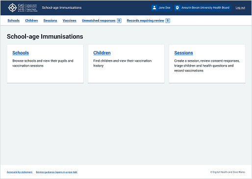
Welsh Immunisation System (WIS)
This example shows a dashboard from the School-age Immunisations service within WIS. It uses cards to visually group related content and tasks, providing users with clear, immediate entry points to different parts of the service.