Tabs
Updated in October 2026
Use tabs to let users navigate between related sections of content, displaying 1 section at a time.
Past day
| Case manager | Cases opened | Cases closed |
|---|---|---|
| Amina Rahman | 3 | 0 |
| Daniel Chen | 1 | 0 |
| Nia Morgan | 2 | 0 |
Past week
Case activity for the past week.
Past month
Case activity for the past month.
Past year
Case activity for the past year.
<div class="nhsw-tabs">
  <ul class="nhsw-tabs__list" role="tablist">
    <li role="presentation">
      <button class="nhsw-tabs__tab nhsw-tabs__tab--selected" role="tab" aria-selected="true" aria-controls="panel-day" id="tab-day"><span class="nhsw-tabs__tab-text">Past day</span></button>
    </li>
    <li role="presentation">
      <button class="nhsw-tabs__tab" role="tab" aria-selected="false" aria-controls="panel-week" id="tab-week"><span class="nhsw-tabs__tab-text">Past week</span></button>
    </li>
    <li role="presentation">
      <button class="nhsw-tabs__tab" role="tab" aria-selected="false" aria-controls="panel-month" id="tab-month"><span class="nhsw-tabs__tab-text">Past month</span></button>
    </li>
    <li role="presentation">
      <button class="nhsw-tabs__tab" role="tab" aria-selected="false" aria-controls="panel-year" id="tab-year"><span class="nhsw-tabs__tab-text">Past year</span></button>
    </li>
  </ul>
  <div class="nhsw-tabs__panel" id="panel-day" role="tabpanel" aria-labelledby="tab-day">
    <h2 class="nhsw-h2">Past day</h2>
    <table class="nhsw-table-responsive" role="table">
      <thead class="nhsw-table__head" role="rowgroup">
        <tr class="nhsw-table__row" role="row">
          <th scope="col" class="nhsw-table__header" role="columnheader">Case manager</th>
          <th scope="col" class="nhsw-table__header" role="columnheader">Cases opened</th>
          <th scope="col" class="nhsw-table__header" role="columnheader">Cases closed</th>
        </tr>
      </thead>
      <tbody class="nhsw-table__body" role="rowgroup">
        <tr class="nhsw-table__row" role="row">
          <th scope="row" class="nhsw-table__header" role="rowheader">
            <span class="nhsw-table-responsive__heading" aria-hidden="true">Case manager </span>
            Amina Rahman
          </th>
          <td class="nhsw-table__cell" role="cell">
            <span class="nhsw-table-responsive__heading" aria-hidden="true">Cases opened </span>
            3
          </td>
          <td class="nhsw-table__cell" role="cell">
            <span class="nhsw-table-responsive__heading" aria-hidden="true">Cases closed </span>
            0
          </td>
        </tr>
        <tr class="nhsw-table__row" role="row">
          <th scope="row" class="nhsw-table__header" role="rowheader">
            <span class="nhsw-table-responsive__heading" aria-hidden="true">Case manager </span>
            Daniel Chen
          </th>
          <td class="nhsw-table__cell" role="cell">
            <span class="nhsw-table-responsive__heading" aria-hidden="true">Cases opened </span>
            1
          </td>
          <td class="nhsw-table__cell" role="cell">
            <span class="nhsw-table-responsive__heading" aria-hidden="true">Cases closed </span>
            0
          </td>
        </tr>
        <tr class="nhsw-table__row" role="row">
          <th scope="row" class="nhsw-table__header" role="rowheader">
            <span class="nhsw-table-responsive__heading" aria-hidden="true">Case manager </span>
            Nia Morgan
          </th>
          <td class="nhsw-table__cell" role="cell">
            <span class="nhsw-table-responsive__heading" aria-hidden="true">Cases opened </span>
            2
          </td>
          <td class="nhsw-table__cell" role="cell">
            <span class="nhsw-table-responsive__heading" aria-hidden="true">Cases closed </span>
            0
          </td>
        </tr>
      </tbody>
    </table>
  </div>
  <div class="nhsw-tabs__panel nhsw-tabs__panel--hidden" id="panel-week" role="tabpanel" aria-labelledby="tab-week">
    <h2 class="nhsw-h2">Past week</h2>
    <p class="nhsw-body">Case activity for the past week.</p>
  </div>
  <div class="nhsw-tabs__panel nhsw-tabs__panel--hidden" id="panel-month" role="tabpanel" aria-labelledby="tab-month">
    <h2 class="nhsw-h2">Past month</h2>
    <p class="nhsw-body">Case activity for the past month.</p>
  </div>
  <div class="nhsw-tabs__panel nhsw-tabs__panel--hidden" id="panel-year" role="tabpanel" aria-labelledby="tab-year">
    <h2 class="nhsw-h2">Past year</h2>
    <p class="nhsw-body">Case activity for the past year.</p>
  </div>
</div>
{% from "tabs/macro.njk" import nhswTabs %}
{{ nhswTabs({
items: [
{
label: "Past day",
id: "day",
html: "<h2 class=\"nhsw-h2\">Past day</h2><table class=\"nhsw-table-responsive\" role=\"table\"><thead class=\"nhsw-table__head\" role=\"rowgroup\"><tr class=\"nhsw-table__row\" role=\"row\"><th scope=\"col\" class=\"nhsw-table__header\" role=\"columnheader\">Case manager</th><th scope=\"col\" class=\"nhsw-table__header\" role=\"columnheader\">Cases opened</th><th scope=\"col\" class=\"nhsw-table__header\" role=\"columnheader\">Cases closed</th></tr></thead><tbody class=\"nhsw-table__body\" role=\"rowgroup\"><tr class=\"nhsw-table__row\" role=\"row\"><th scope=\"row\" class=\"nhsw-table__header\" role=\"rowheader\"><span class=\"nhsw-table-responsive__heading\" aria-hidden=\"true\">Case manager </span>Amina Rahman</th><td class=\"nhsw-table__cell\" role=\"cell\"><span class=\"nhsw-table-responsive__heading\" aria-hidden=\"true\">Cases opened </span>3</td><td class=\"nhsw-table__cell\" role=\"cell\"><span class=\"nhsw-table-responsive__heading\" aria-hidden=\"true\">Cases closed </span>0</td></tr><tr class=\"nhsw-table__row\" role=\"row\"><th scope=\"row\" class=\"nhsw-table__header\" role=\"rowheader\"><span class=\"nhsw-table-responsive__heading\" aria-hidden=\"true\">Case manager </span>Daniel Chen</th><td class=\"nhsw-table__cell\" role=\"cell\"><span class=\"nhsw-table-responsive__heading\" aria-hidden=\"true\">Cases opened </span>1</td><td class=\"nhsw-table__cell\" role=\"cell\"><span class=\"nhsw-table-responsive__heading\" aria-hidden=\"true\">Cases closed </span>0</td></tr><tr class=\"nhsw-table__row\" role=\"row\"><th scope=\"row\" class=\"nhsw-table__header\" role=\"rowheader\"><span class=\"nhsw-table-responsive__heading\" aria-hidden=\"true\">Case manager </span>Nia Morgan</th><td class=\"nhsw-table__cell\" role=\"cell\"><span class=\"nhsw-table-responsive__heading\" aria-hidden=\"true\">Cases opened </span>2</td><td class=\"nhsw-table__cell\" role=\"cell\"><span class=\"nhsw-table-responsive__heading\" aria-hidden=\"true\">Cases closed </span>0</td></tr></tbody></table>"
},
{ label: "Past week", id: "week", html: "<h2 class=\"nhsw-h2\">Past week</h2><p class=\"nhsw-body\">Case activity for the past week.</p>" },
{ label: "Past month", id: "month", html: "<h2 class=\"nhsw-h2\">Past month</h2><p class=\"nhsw-body\">Case activity for the past month.</p>" },
{ label: "Past year", id: "year", html: "<h2 class=\"nhsw-h2\">Past year</h2><p class=\"nhsw-body\">Case activity for the past year.</p>" }
]
}) }}When to use tabs
The tabs component lets users navigate between related sections of content, displaying 1 section at a time.
Tabs can be a helpful way of letting users quickly switch between related information if:
- your content can be usefully separated into clearly labelled sections
- the 1st section is more relevant than the others for most users
- users will not need to view all the sections at once
Tabs can work well for people who use a service regularly, for example, staff using a patient record system. Their need to perform tasks quickly may be greater than their need for simplicity of first-time use.
Test your content without tabs first. Consider if it's better to:
- simplify and reduce the amount of content
- split the content across multiple pages
- keep the content on a single page, separated by headings
- use a table of contents to let users navigate quickly to specific sections of content
When to not use tabs
Do not use the tabs component if the total amount of content the tabs contain will make the page slow to load. For this reason, do not use the tabs component as a form of page navigation.
Tabs hide content from users and not everyone will notice them or understand how they work.
Do not use tabs if your users might need to:
- read through all of the content in order, for example, to understand a step-by-step process
- compare information in different tabs, because having to memorise information and switch backwards and forwards can be difficult
How to use tabs
Decide between using tabs, expanders and the details component
Tabs, expanders, and details all hide sections of content which a user can choose to reveal.
If you decide to use 1 of these components, consider if:
- the user needs to view more than 1 section at a time – if not, use tabs
- the user needs to switch quickly between sections – tabs can show content without pushing other sections down the page, unlike expanders
- you have 7 or more sections of content – tabs are arranged horizontally, so may not work well, while expanders are arranged vertically
- there are only 1 or 2 sections of short, less important content – the details component is more suitable as it's visually smaller and less prominent than an expander or tabs
Use clear labels
Tabs hide content, so the tab labels need to make it very clear what they link to. Otherwise users will not know if they need to click on them.
If you struggle to come up with clear labels, it might be because the way you've separated the content is not clear.
Order the tabs according to user needs
The 1st tab should be the most commonly needed section. Arrange the other tabs in the order that makes most sense for your users.
Do not disable tabs
Disabling elements is normally confusing for users. If there is no content for a tab, either remove the tab or, if that would be confusing for your users, explain why there is no content when the tab is selected.
Avoid tabs that wrap over more than 1 line
If you use too many tabs or they have long labels then they may wrap over more than 1 line. This makes it harder for users to see the connection between the selected tab and its content.
Accessibility
Keyboard users should be able to move focus between tabs using arrow keys and select a tab by pressing enter. This supports WCAG 2.2 Success Criterion 2.1.1 Keyboard, level A.
Screen reader users should hear which tab is currently focused, how many tabs there are and whether the current tab is open. This supports WCAG 2.2 Success Criterion 4.1.2 Name, Role, Value, level A.
Source
Learn more about Tabs in the GOV.UK Design System.
Tabs variants
Past day
| Case manager | Cases opened | Cases closed |
|---|---|---|
| Amina Rahman | 3 | 0 |
| Daniel Chen | 1 | 0 |
| Nia Morgan | 2 | 0 |
Past week
Case activity for the past week.
Past month
Case activity for the past month.
Past year
Case activity for the past year.
<div class="nhsw-tabs">
  <ul class="nhsw-tabs__list" role="tablist">
    <li role="presentation">
      <button class="nhsw-tabs__tab nhsw-tabs__tab--selected" role="tab" aria-selected="true" aria-controls="panel-day" id="tab-day"><span class="nhsw-tabs__tab-text">Past day</span> <strong class="nhsw-tag nhsw-tag--blue">112</strong></button>
    </li>
    <li role="presentation">
      <button class="nhsw-tabs__tab" role="tab" aria-selected="false" aria-controls="panel-week" id="tab-week"><span class="nhsw-tabs__tab-text">Past week</span></button>
    </li>
    <li role="presentation">
      <button class="nhsw-tabs__tab" role="tab" aria-selected="false" aria-controls="panel-month" id="tab-month"><span class="nhsw-tabs__tab-text">Past month</span></button>
    </li>
    <li role="presentation">
      <button class="nhsw-tabs__tab" role="tab" aria-selected="false" aria-controls="panel-year" id="tab-year"><span class="nhsw-tabs__tab-text">Past year</span></button>
    </li>
  </ul>
  <div class="nhsw-tabs__panel" id="panel-day" role="tabpanel" aria-labelledby="tab-day">
    <h2 class="nhsw-h2">Past day</h2>
    <table class="nhsw-table-responsive" role="table">
      <thead class="nhsw-table__head" role="rowgroup">
        <tr class="nhsw-table__row" role="row">
          <th scope="col" class="nhsw-table__header" role="columnheader">Case manager</th>
          <th scope="col" class="nhsw-table__header" role="columnheader">Cases opened</th>
          <th scope="col" class="nhsw-table__header" role="columnheader">Cases closed</th>
        </tr>
      </thead>
      <tbody class="nhsw-table__body" role="rowgroup">
        <tr class="nhsw-table__row" role="row">
          <th scope="row" class="nhsw-table__header" role="rowheader">
            <span class="nhsw-table-responsive__heading" aria-hidden="true">Case manager </span>
            Amina Rahman
          </th>
          <td class="nhsw-table__cell" role="cell">
            <span class="nhsw-table-responsive__heading" aria-hidden="true">Cases opened </span>
            3
          </td>
          <td class="nhsw-table__cell" role="cell">
            <span class="nhsw-table-responsive__heading" aria-hidden="true">Cases closed </span>
            0
          </td>
        </tr>
        <tr class="nhsw-table__row" role="row">
          <th scope="row" class="nhsw-table__header" role="rowheader">
            <span class="nhsw-table-responsive__heading" aria-hidden="true">Case manager </span>
            Daniel Chen
          </th>
          <td class="nhsw-table__cell" role="cell">
            <span class="nhsw-table-responsive__heading" aria-hidden="true">Cases opened </span>
            1
          </td>
          <td class="nhsw-table__cell" role="cell">
            <span class="nhsw-table-responsive__heading" aria-hidden="true">Cases closed </span>
            0
          </td>
        </tr>
        <tr class="nhsw-table__row" role="row">
          <th scope="row" class="nhsw-table__header" role="rowheader">
            <span class="nhsw-table-responsive__heading" aria-hidden="true">Case manager </span>
            Nia Morgan
          </th>
          <td class="nhsw-table__cell" role="cell">
            <span class="nhsw-table-responsive__heading" aria-hidden="true">Cases opened </span>
            2
          </td>
          <td class="nhsw-table__cell" role="cell">
            <span class="nhsw-table-responsive__heading" aria-hidden="true">Cases closed </span>
            0
          </td>
        </tr>
      </tbody>
    </table>
  </div>
  <div class="nhsw-tabs__panel nhsw-tabs__panel--hidden" id="panel-week" role="tabpanel" aria-labelledby="tab-week">
    <h2 class="nhsw-h2">Past week</h2>
    <p class="nhsw-body">Case activity for the past week.</p>
  </div>
  <div class="nhsw-tabs__panel nhsw-tabs__panel--hidden" id="panel-month" role="tabpanel" aria-labelledby="tab-month">
    <h2 class="nhsw-h2">Past month</h2>
    <p class="nhsw-body">Case activity for the past month.</p>
  </div>
  <div class="nhsw-tabs__panel nhsw-tabs__panel--hidden" id="panel-year" role="tabpanel" aria-labelledby="tab-year">
    <h2 class="nhsw-h2">Past year</h2>
    <p class="nhsw-body">Case activity for the past year.</p>
  </div>
</div>
{% from "tabs/macro.njk" import nhswTabs %}
{{ nhswTabs({
items: [
{
label: "Past day",
id: "day",
count: "112",
html: "<h2 class=\"nhsw-h2\">Past day</h2><table class=\"nhsw-table-responsive\" role=\"table\"><thead class=\"nhsw-table__head\" role=\"rowgroup\"><tr class=\"nhsw-table__row\" role=\"row\"><th scope=\"col\" class=\"nhsw-table__header\" role=\"columnheader\">Case manager</th><th scope=\"col\" class=\"nhsw-table__header\" role=\"columnheader\">Cases opened</th><th scope=\"col\" class=\"nhsw-table__header\" role=\"columnheader\">Cases closed</th></tr></thead><tbody class=\"nhsw-table__body\" role=\"rowgroup\"><tr class=\"nhsw-table__row\" role=\"row\"><th scope=\"row\" class=\"nhsw-table__header\" role=\"rowheader\"><span class=\"nhsw-table-responsive__heading\" aria-hidden=\"true\">Case manager </span>Amina Rahman</th><td class=\"nhsw-table__cell\" role=\"cell\"><span class=\"nhsw-table-responsive__heading\" aria-hidden=\"true\">Cases opened </span>3</td><td class=\"nhsw-table__cell\" role=\"cell\"><span class=\"nhsw-table-responsive__heading\" aria-hidden=\"true\">Cases closed </span>0</td></tr><tr class=\"nhsw-table__row\" role=\"row\"><th scope=\"row\" class=\"nhsw-table__header\" role=\"rowheader\"><span class=\"nhsw-table-responsive__heading\" aria-hidden=\"true\">Case manager </span>Daniel Chen</th><td class=\"nhsw-table__cell\" role=\"cell\"><span class=\"nhsw-table-responsive__heading\" aria-hidden=\"true\">Cases opened </span>1</td><td class=\"nhsw-table__cell\" role=\"cell\"><span class=\"nhsw-table-responsive__heading\" aria-hidden=\"true\">Cases closed </span>0</td></tr><tr class=\"nhsw-table__row\" role=\"row\"><th scope=\"row\" class=\"nhsw-table__header\" role=\"rowheader\"><span class=\"nhsw-table-responsive__heading\" aria-hidden=\"true\">Case manager </span>Nia Morgan</th><td class=\"nhsw-table__cell\" role=\"cell\"><span class=\"nhsw-table-responsive__heading\" aria-hidden=\"true\">Cases opened </span>2</td><td class=\"nhsw-table__cell\" role=\"cell\"><span class=\"nhsw-table-responsive__heading\" aria-hidden=\"true\">Cases closed </span>0</td></tr></tbody></table>"
},
{ label: "Past week", id: "week", html: "<h2 class=\"nhsw-h2\">Past week</h2><p class=\"nhsw-body\">Case activity for the past week.</p>" },
{ label: "Past month", id: "month", html: "<h2 class=\"nhsw-h2\">Past month</h2><p class=\"nhsw-body\">Case activity for the past month.</p>" },
{ label: "Past year", id: "year", html: "<h2 class=\"nhsw-h2\">Past year</h2><p class=\"nhsw-body\">Case activity for the past year.</p>" }
]
}) }}Add a tag to a tab label when you need to draw attention to a quantity, status or update. It provides additional context about a section, for example:
- unread notifications
- pending actions
- total number of records
- filtered results
Examples
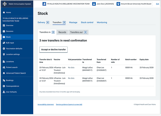
Welsh Immunisation System (WIS)
This example shows the "Stock" management screen within WIS. It uses tabs to group related stock tasks together while displaying 1 focused section at a time.