Notification banners
Updated in October 2026
Use a notification banner to tell the user something they need to know that's not directly related to the page content.
<div class="nhsw-notification-banner" role="region" aria-labelledby="notification-title">
  <div class="nhsw-notification-banner__header">
    <h2 class="nhsw-notification-banner__title" id="notification-title">Important</h2>
  </div>
  <div class="nhsw-notification-banner__content">
    <p class="nhsw-notification-banner__heading">You have 7 days left to send your application. <a class="nhsw-link nhsw-notification-banner__link" href="#">View application</a>.</p>
  </div>
</div>
{% from "notification-banner/macro.njk" import nhswNotificationBanner %}
{{ nhswNotificationBanner({
titleText: "Important",
html: "You have 7 days left to send your application. <a class=\"nhsw-link nhsw-notification-banner__link\" href=\"#\">View application</a>."
}) }}When to use a notification banner
A notification banner lets you tell the user about something that's not directly relevant to the thing they're trying to do on that page of the service.
There are 2 versions of the notification banner:
Use the information banner to tell the user about:
- something that affects the service as a whole (such as delays in processing applications or planned downtime)
- something that affects them in particular (for example, an approaching deadline they need to meet)
Use the success banner to tell the user that something they've just done on a previous page was successful (for example, confirming that an email has been sent).
When not to use a notification banner
Use notification banners sparingly. There's evidence that people often miss banners. Using them too often is likely to make this problem worse. See Banner blindness revisited by Nielsen Norman Group.
Avoid showing more than 1 notification banner on the same page. Instead, combine the messages in a single notification banner. If the messages are too different to combine, decide which is your highest priority message and show that one.
If the information is directly relevant to the thing the user is doing on that page, put the information in the main page content instead. If it needs to stand out, use:
Do not use a notification banner to tell the user about validation errors. Use an error summary component instead.
Do not show a notification banner and an error summary component on the same page. Just show the error summary.
How to use a notification banner
Put the notification banner at top of the main container. If your page includes breadcrumbs or a back link, place it below these but before the <h1>.
The notification banner should be the same width as the page's other content, such as components, headings and body text. For example, if the other content takes up two-thirds of the screen on desktop devices, then the notification banner should also take up two-thirds. Read about how to lay out pages.
Use role="region" and aria-labelledby="nhsw-notification-banner-title" (with id="nhsw-notification-banners-title" on nhsw-notification-banner__title) so that screen reader users can navigate to the notification banner.
Notification banner headings
The notification banner starts with a heading like "Important" or "Success". This is usually an <h2>.
If you need a heading in the banner content, place it in <div class="nhsw-notification-banner__content">. It will normally be an <h3>.
Do not use a heading for single line notifications. You can apply the nhsw-notification-banner__heading class to a paragraph to make it stand out.
Accessibility
Use a heading like "Success" so users do not need to rely on colour alone to understand the meaning of the banner. Some users may not perceive colour differences, so the heading gives a clear text alternative. This supports WCAG 2.2 Success Criterion 1.4.1 Use of Colour, level A.
Use the same heading for banners throughout a service so users learn to recognise and understand them consistently. Reusing the same language for components that perform the same function helps reduce cognitive effort and creates predictable user experiences. This supports WCAG 2.2 Success Criterion 3.2.4 Consistent Identification, level AA.
The success banner should include role="alert" when a success message needs to be announced automatically by assistive technologies without moving keyboard focus. This helps to make users aware of important updates without needing to locate the banner themselves. This supports WCAG 2.2 Success Criterion 4.1.3: Status Messages at level AA.
Source
Learn more about Notification banners in GOV.UK Design System.
Notification banner variants
Information banner
<div class="nhsw-notification-banner" role="region" aria-labelledby="notification-title-service">
  <div class="nhsw-notification-banner__header">
    <h2 class="nhsw-notification-banner__title" id="notification-title-service">Important</h2>
  </div>
  <div class="nhsw-notification-banner__content">
    <p class="nhsw-notification-banner__heading">The service will be unavailable from 8pm to 9pm on Thursday 1 January 2027.</p>
  </div>
</div>
{{ nhswNotificationBanner({
titleText: "Important",
text: "The service will be unavailable from 8pm to 9pm on Thursday 1 January 2027."
}) }}Use an information banner to tell users about something that affects the service as a whole.
For example:
- in a service that lets the user apply for something, they might need to know that it's taking longer than usual to process applications
- in an account-type service, the user might need to know that the service will be down for scheduled maintenance
If your service is getting more demand than usual, check that you've set up 'There is a problem with the service' pages and 'Service unavailable' pages, and the wording is up to date. Follow GOV.UK guidance on There is a problem with the service pages and Service unavailable pages in GOV.UK Design System.
You can also use the information banner to tell users information about something that's happening elsewhere in the service. For example:
- in a case working system, the user might need to know that there are new cases waiting for their attention
- in an account-type service, you might need to tell the user that there's a deadline approaching or that a payment is overdue
Success banner
<div class="nhsw-notification-banner nhsw-notification-banner--success" role="alert" aria-labelledby="notification-title-success">
  <div class="nhsw-notification-banner__header">
    <h3 class="nhsw-notification-banner__title" id="notification-title-success">Success</h3>
  </div>
  <div class="nhsw-notification-banner__content">
    <h3 class="nhsw-notification-banner__heading">Vaccination outcome recorded for HPV</h3>
    <p class="nhsw-body">Contact <a class="nhsw-link nhsw-notification-banner__link" href="#">example@wales.nhs.uk</a> if you think there's a problem.</p>
  </div>
</div>
{{ nhswNotificationBanner({
type: "success",
titleText: "Success",
titleHeadingLevel: "3",
contentIsHeading: true,
text: "Vaccination outcome recorded for HPV",
bodyHtml: "Contact <a class=\"nhsw-link nhsw-notification-banner__link\" href=\"#\">example@wales.nhs.uk</a> if you think there's a problem."
}) }}Use a success banner to confirm an action on a previous page was successful. For example, for steps in a long journey or small repeated tasks.
Remove the success banner when the user moves to a new page.
Use a panel component instead of a success banner when users have completed an entire journey or task. For example, after submitting a registration, application or consent form.
Since you're using the notification banner to tell the user about the outcome of something they've just done, add role="alert" so assistive technologies can announce the message without moving keyboard focus.
Examples
Welsh Immunisation System (WIS)
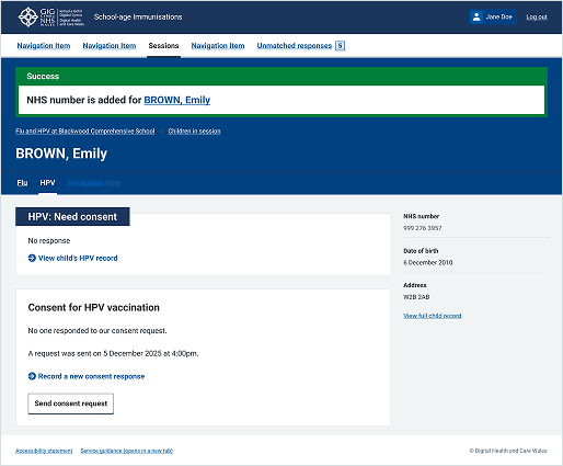
This example is from the School-age Immunisations service within WIS. It shows a notification banner used to highlight success with adding an NHS number.