Checkboxes
Updated in October 2026
Use checkboxes to let users select 1 or more options on a form.
<fieldset class="nhsw-fieldset" aria-describedby="contact-hint">
  <legend class="nhsw-fieldset__legend nhsw-h2">How do you want to be contacted about this?</legend>
  <div class="nhsw-hint" id="contact-hint">Select all options that are relevant to you</div>
  <div class="nhsw-checkboxes">
    <div class="nhsw-checkboxes__item">
      <input class="nhsw-checkboxes__input" id="contact-1" name="contact" type="checkbox" value="email">
      <label class="nhsw-label nhsw-checkboxes__label" for="contact-1">Email</label>
    </div>
  </div>
</fieldset>
{% from "checkboxes/macro.njk" import nhswCheckboxes %}
{{ nhswCheckboxes({
name: "contact",
fieldset: { legend: { text: "How do you want to be contacted about this?" } },
hint: { text: "Select all options that are relevant to you" },
items: [
{ text: "Email", value: "email" }
]
}) }}When to use checkboxes
Use checkboxes when you need to help users:
- select more than 1 option from a list
- toggle a single option on or off
When not to use checkboxes
Do not use the checkboxes component if users can only choose 1 option from a selection. In this case, use a radio.
How to use checkboxes
Position checkboxes to the left of their labels. This makes them easier to find, especially for users of screen magnifiers.
Do not pre-select checkbox options as this makes it more likely that users will:
- not realise they've missed a question
- submit the wrong answer
Order checkbox options alphabetically by default. In some cases, it's helpful to order them from most-to-least common options, for example, by population size. But be careful, as this can reinforce bias. If in doubt, order alphabetically.
Group checkboxes together in a <fieldset> with a <legend> that describes them. You can see an example at the top of this page. The legend is usually a question, like "How do you want to be contacted about this?".
Error messages
<div class="nhsw-form-group nhsw-form-group--error">
  <fieldset class="nhsw-fieldset" aria-describedby="contact-hint contact-error">
    <legend class="nhsw-fieldset__legend nhsw-h2">How do you want to be contacted about this?</legend>
    <div class="nhsw-hint" id="contact-hint">Select all options that are relevant to you</div>
    <p class="nhsw-error-message" id="contact-error"><span class="nhsw-visually-hidden">Error: </span>Select how you want to be contacted</p>
    <div class="nhsw-checkboxes">
      <div class="nhsw-checkboxes__item">
        <input class="nhsw-checkboxes__input" id="contact-1" name="contact" type="checkbox" value="email" aria-invalid="true">
        <label class="nhsw-label nhsw-checkboxes__label" for="contact-1">Email</label>
      </div>
    </div>
  </fieldset>
</div>
{{ nhswCheckboxes({
name: "contact",
fieldset: { legend: { text: "How do you want to be contacted about this?" } },
hint: { text: "Select all options that are relevant to you" },
errorMessage: { text: "Select how you want to be contacted" },
items: [
{ text: "Email", value: "email" }
]
}) }}Use this style to show users when there is a problem with their checkbox selection and explain what they need to do to fix it.
Follow:
- NHS England Design System guidance on error messages
- GOV.UK Design System guidance on error messages for checkboxes
Accessibility
Users are not always notified when a conditionally revealed question is shown or hidden. This fails WCAG 2.2 Success Criterion 4.1.2 Name, Role, Value, level A.
However, GOV.UK research into conditionally revealed questions found that this was less of an issue when questions were simple and easy to understand. Complex questions are more likely to cause confusion for users.
Source
Learn more about Checkboxes in the GOV.UK Design System.
Checkboxes variants
Inline checkboxes
<div class="nhsw-form-group">
  <fieldset class="nhsw-fieldset">
    <legend class="nhsw-fieldset__legend nhsw-h2">Which nipple has changed?</legend>
    <div class="nhsw-checkboxes nhsw-checkboxes--inline">
      <div class="nhsw-checkboxes__item">
        <input class="nhsw-checkboxes__input" id="nipple-right" name="nipple" type="checkbox" value="right">
        <label class="nhsw-label nhsw-checkboxes__label" for="nipple-right">Right nipple</label>
      </div>
      <div class="nhsw-checkboxes__item">
        <input class="nhsw-checkboxes__input" id="nipple-left" name="nipple" type="checkbox" value="left">
        <label class="nhsw-label nhsw-checkboxes__label" for="nipple-left">Left nipple</label>
      </div>
    </div>
  </fieldset>
</div>
{{ nhswCheckboxes({
name: "nipple",
fieldset: { legend: { text: "Which nipple has changed?" } },
classes: "nhsw-checkboxes--inline",
items: [
{ text: "Right nipple", value: "right", id: "nipple-right" },
{ text: "Left nipple", value: "left", id: "nipple-left" }
]
}) }}Use inline checkboxes when users need to choose from only 2 options and both option labels are short. Displaying checkboxes horizontally can reduce the amount of space needed and make related options easier to compare.
Do not use inline checkboxes if:
- there are more than 2 options
- either option label is long or may wrap onto multiple lines
On small screens, such as mobile devices, inline checkboxes automatically stack on top of each other (vertically) to maintain readability and usability.
Checkboxes with hint text
Checkbox items with hints
<fieldset class="nhsw-fieldset" aria-describedby="conditions-hint">
  <legend class="nhsw-fieldset__legend nhsw-h2">What medical conditions do you have?</legend>
  <div class="nhsw-hint" id="conditions-hint">Select 1 or more</div>
  <div class="nhsw-checkboxes">
    <div class="nhsw-checkboxes__item">
      <input class="nhsw-checkboxes__input" id="condition-1" name="condition" type="checkbox" value="alzheimers">
      <label class="nhsw-label nhsw-checkboxes__label" for="condition-1">Alzheimer's disease or dementia</label>
    </div>
    <div class="nhsw-checkboxes__item">
      <input class="nhsw-checkboxes__input" id="condition-2" name="condition" type="checkbox" value="asthma">
      <label class="nhsw-label nhsw-checkboxes__label" for="condition-2">Asthma</label>
    </div>
    <div class="nhsw-checkboxes__item">
      <input class="nhsw-checkboxes__input" id="condition-3" name="condition" type="checkbox" value="cancer">
      <label class="nhsw-label nhsw-checkboxes__label" for="condition-3">Cancer</label>
    </div>
    <div class="nhsw-checkboxes__item">
      <input class="nhsw-checkboxes__input" id="condition-4" name="condition" type="checkbox" value="diabetes" aria-describedby="condition-4-hint">
      <label class="nhsw-label nhsw-checkboxes__label" for="condition-4">Diabetes</label>
      <div class="nhsw-hint nhsw-checkboxes__hint" id="condition-4-hint">including type 1, type 2, and gestational diabetes</div>
    </div>
  </div>
</fieldset>
{{ nhswCheckboxes({
name: "condition",
fieldset: { legend: { text: "What medical conditions do you have?" } },
hint: { text: "Select 1 or more" },
items: [
{ text: "Alzheimer's disease or dementia", value: "alzheimers", id: "condition-1" },
{ text: "Asthma", value: "asthma", id: "condition-2" },
{ text: "Cancer", value: "cancer", id: "condition-3" },
{ text: "Diabetes", value: "diabetes", id: "condition-4", hint: { text: "including type 1, type 2, and gestational diabetes" } }
]
}) }}Unlike with radios, users can select more than 1 option from a list of checkboxes. Do not assume that users will know how many options they can select.
Use hint text to give users help in context. For example, say "Select all the options that are relevant to you". Read more about hint text.
You can add hints to checkbox items to provide additional information about the options.
Add an option for "none"
<fieldset class="nhsw-fieldset" aria-describedby="symptoms-hint">
  <legend class="nhsw-fieldset__legend nhsw-h2">Do you have any of these symptoms?</legend>
  <div class="nhsw-hint" id="symptoms-hint">Select all the symptoms you have</div>
  <div class="nhsw-checkboxes">
    <div class="nhsw-checkboxes__item">
      <input class="nhsw-checkboxes__input" id="symptoms-1" name="symptoms" type="checkbox" value="sore-throat">
      <label class="nhsw-label nhsw-checkboxes__label" for="symptoms-1">Sore throat</label>
    </div>
    <div class="nhsw-checkboxes__item">
      <input class="nhsw-checkboxes__input" id="symptoms-2" name="symptoms" type="checkbox" value="runny-nose">
      <label class="nhsw-label nhsw-checkboxes__label" for="symptoms-2">Runny nose</label>
    </div>
    <div class="nhsw-checkboxes__item">
      <input class="nhsw-checkboxes__input" id="symptoms-3" name="symptoms" type="checkbox" value="joint-pain">
      <label class="nhsw-label nhsw-checkboxes__label" for="symptoms-3">Muscle or joint pain</label>
    </div>
    <div class="nhsw-checkboxes__divider">or</div>
    <div class="nhsw-checkboxes__item">
      <input class="nhsw-checkboxes__input" id="symptoms-none" name="symptoms" type="checkbox" value="none" data-checkbox-exclusive>
      <label class="nhsw-label nhsw-checkboxes__label" for="symptoms-none">No, I do not have any of these symptoms</label>
    </div>
  </div>
</fieldset>
{{ nhswCheckboxes({
name: "symptoms",
fieldset: { legend: { text: "Do you have any of these symptoms?" } },
hint: { text: "Select all the symptoms you have" },
items: [
{ text: "Sore throat", value: "sore-throat", id: "symptoms-1" },
{ text: "Runny nose", value: "runny-nose", id: "symptoms-2" },
{ text: "Muscle or joint pain", value: "joint-pain", id: "symptoms-3" },
{ divider: "or" },
{ text: "No, I do not have any of these symptoms", value: "none", id: "symptoms-none", behaviour: "exclusive" }
]
}) }}You can give users the option to say none of the other options apply to them.
This option means users need to actively select "none" rather than leave all the boxes unchecked, which makes sure they do not skip the question by accident.
Remember to start by asking 1 question per page. You might be able to remove the need for a "none" option by asking the user a better question or by using filter questions to filter users out beforehand.
Show the "none" option last. Separate it from the other options using a divider, normally the word "or".
Write a label that repeats the key part of the question. For example, for the question "Do you have any of these symptoms?", say "No, I do not have any of these symptoms". Avoid phrases like "none of the above" because this is a visual reference and might be hard for people who use screen readers to understand.
To enable some JavaScript that unchecks all other checkboxes when the user clicks "none", add the data-checkbox-exclusive behaviour to the "none" checkbox.
If JavaScript is unavailable, and a user selects both the "none" checkbox and another checkbox, display an error message.
Conditionally revealing a related question
<fieldset class="nhsw-fieldset" aria-describedby="contact-hint">
  <legend class="nhsw-fieldset__legend nhsw-h2">How do you want to be contacted about this?</legend>
  <div class="nhsw-hint" id="contact-hint">Select all options that are relevant to you</div>
  <div class="nhsw-checkboxes">
    <div class="nhsw-checkboxes__item">
      <input class="nhsw-checkboxes__input" id="contact-1" name="contact" type="checkbox" value="email" data-aria-controls="conditional-contact-1" checked>
      <label class="nhsw-label nhsw-checkboxes__label" for="contact-1">Email</label>
    </div>
    <div class="nhsw-checkboxes__conditional" id="conditional-contact-1" aria-live="polite">
      <div class="nhsw-form-group">
        <label class="nhsw-label" for="email">Email address</label>
        <input class="nhsw-input" id="email" name="email" type="email">
      </div>
    </div>
    <div class="nhsw-checkboxes__item">
      <input class="nhsw-checkboxes__input" id="contact-2" name="contact" type="checkbox" value="phone" data-aria-controls="conditional-contact-2" checked>
      <label class="nhsw-label nhsw-checkboxes__label" for="contact-2">Phone</label>
    </div>
    <div class="nhsw-checkboxes__conditional" id="conditional-contact-2" aria-live="polite">
      <div class="nhsw-form-group">
        <label class="nhsw-label" for="phone">Phone number</label>
        <input class="nhsw-input" id="phone" name="phone" type="tel">
      </div>
    </div>
    <div class="nhsw-checkboxes__item">
      <input class="nhsw-checkboxes__input" id="contact-3" name="contact" type="checkbox" value="text" data-aria-controls="conditional-contact-3" checked>
      <label class="nhsw-label nhsw-checkboxes__label" for="contact-3">Text message</label>
    </div>
    <div class="nhsw-checkboxes__conditional" id="conditional-contact-3" aria-live="polite">
      <div class="nhsw-form-group">
        <label class="nhsw-label" for="mobile">Mobile phone number</label>
        <input class="nhsw-input" id="mobile" name="mobile" type="tel">
      </div>
    </div>
  </div>
</fieldset>
{{ nhswCheckboxes({
name: "contact",
fieldset: { legend: { text: "How do you want to be contacted about this?" } },
hint: { text: "Select all options that are relevant to you" },
items: [
{
text: "Email",
value: "email",
id: "contact-1",
checked: true,
conditional: {
html: "<div class=\"nhsw-form-group\"><label class=\"nhsw-label\" for=\"email\">Email address</label><input class=\"nhsw-input\" id=\"email\" name=\"email\" type=\"email\"></div>"
}
},
{
text: "Phone",
value: "phone",
id: "contact-2",
checked: true,
conditional: {
html: "<div class=\"nhsw-form-group\"><label class=\"nhsw-label\" for=\"phone\">Phone number</label><input class=\"nhsw-input\" id=\"phone\" name=\"phone\" type=\"tel\"></div>"
}
},
{
text: "Text message",
value: "text",
id: "contact-3",
checked: true,
conditional: {
html: "<div class=\"nhsw-form-group\"><label class=\"nhsw-label\" for=\"mobile\">Mobile phone number</label><input class=\"nhsw-input\" id=\"mobile\" name=\"mobile\" type=\"tel\"></div>"
}
}
]
}) }}You can add a conditionally revealing related question to checkboxes, so users only see the question when it's relevant to them.
For example, you could reveal a phone number input only when a user chooses to be contacted by phone.
Keep it simple. If you need to add a lot of content, consider showing it on the next page in the process instead.
Only conditionally reveal questions. Do not show or hide anything that is not a question.
Smaller checkboxes
<fieldset class="nhsw-fieldset">
  <legend class="nhsw-fieldset__legend nhsw-h2">Care setting</legend>
  <div class="nhsw-checkboxes nhsw-checkboxes--small">
    <div class="nhsw-checkboxes__item">
      <input class="nhsw-checkboxes__input" id="setting-1" name="setting" type="checkbox" value="ambulance">
      <label class="nhsw-label nhsw-checkboxes__label" for="setting-1">Ambulance or urgent and emergency care</label>
    </div>
    <div class="nhsw-checkboxes__item">
      <input class="nhsw-checkboxes__input" id="setting-2" name="setting" type="checkbox" value="care-home">
      <label class="nhsw-label nhsw-checkboxes__label" for="setting-2">Care home</label>
    </div>
    <div class="nhsw-checkboxes__item">
      <input class="nhsw-checkboxes__input" id="setting-3" name="setting" type="checkbox" value="community">
      <label class="nhsw-label nhsw-checkboxes__label" for="setting-3">Community health</label>
    </div>
    <div class="nhsw-checkboxes__item">
      <input class="nhsw-checkboxes__input" id="setting-4" name="setting" type="checkbox" value="dentistry">
      <label class="nhsw-label nhsw-checkboxes__label" for="setting-4">Dentistry</label>
    </div>
  </div>
</fieldset>
{{ nhswCheckboxes({
name: "setting",
fieldset: { legend: { text: "Care setting" } },
classes: "nhsw-checkboxes--small",
items: [
{ text: "Ambulance or urgent and emergency care", value: "ambulance" },
{ text: "Care home", value: "care-home" },
{ text: "Community health", value: "community" },
{ text: "Dentistry", value: "dentistry" }
]
}) }}Use standard-sized checkboxes in most cases.
You can use small checkboxes where you need something less visually prominent. For example, on:
- a page of search results where users need to see and change search filters without distracting them from the results
- information-dense screens in services designed for repeat use, like staff-facing systems
Examples
Welsh Immunisation System (WIS)
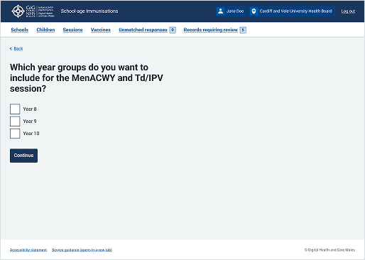
This example is from the School-age Immunisations service within WIS. It shows a set of checkboxes that allow users to select 1 or more options from a list as part of a multi-page form.