Expander
Updated in October 2026
Use an expander to let users reveal detailed information only when they need it.
<div class="nhsw-expander">
  <button type="button" class="nhsw-expander__button" aria-expanded="false" aria-controls="expander-consent">
    <span class="nhsw-expander__heading">
      <span class="nhsw-expander__icon" aria-hidden="true"></span>
      <span class="nhsw-expander__link-text">Digital consent</span>
    </span>
  </button>
  <div class="nhsw-expander__content" id="expander-consent" hidden>
    <p class="nhsw-body">Digital consent lets patients give or withdraw consent for a service online, instead of over the phone or on paper.</p>
  </div>
</div>
{% from "expander/macro.njk" import nhswExpander %}
{{ nhswExpander({
linkText: "Digital consent",
html: "<p class=\"nhsw-body\">Digital consent lets patients give or withdraw consent for a service online, instead of over the phone or on paper.</p>"
}) }}When to use expanders
The expander is a short link in a box that expands into more detailed text when a user clicks on it. It can help to make complex information easier to understand by allowing users to reveal additional details when they need it.
There are 2 ways to let users reveal more information:
- details
- expander
You can use expanders:
- on pages where users find the amount of information overwhelming, as they help to break down information into bite size pieces which the user can "expand" when they're ready to do so
- for information for a wide audience, unlike the details component
- when you see a clear user need for them
Test your content without an expander first. It may be better to:
- simplify and reduce the amount of content
- split the content across multiple pages
- keep the content on a single page, separated by headings
- use a list of links to let users navigate quickly to specific sections of content
When not to use expanders
Do not use an expander:
- if only some of your users will need the information – use details instead
- in forms – instead, add hint text as a part of other form inputs, such as text inputs, radios and checkboxes or use details
- on pages with other interactive elements, such as buttons or text input – there's a risk that expanders will distract users
- inside other patterns
How to use expanders
Make the link text short and descriptive so users can quickly work out if they need to click on it.
Accessibility
The box border outline and the plus/minus toggle icon must have a contrast ratio of at least 3:1 against their background to meet WCAG 2.2 Success Criterion 1.4.11 Non-Text Contrast, level AA.
Make sure assistive technologies accurately announce whether the information panel is open or closed. The toggle button element must dynamically manage state using appropriate structural attributes, such as aria-expanded, to meet WCAG 2.2 Success Criterion 4.1.2 Name, Role, Value, level A.
Source
Learn more about Expanders in the NHS England Design System.
Follow discussions about Expanders on NHS England GitHub to see the latest updates and resolved issues.
Expander variants
There are no variants available for this component.
Contact the DHCW Design System team if the existing component does not meet your requirements. Your feedback helps us understand gaps and prioritise future improvements.
If you adapt the component to meet a specific user need, share your findings with us to help build shared knowledge and support others using it.
Examples
Choose Pharmacy
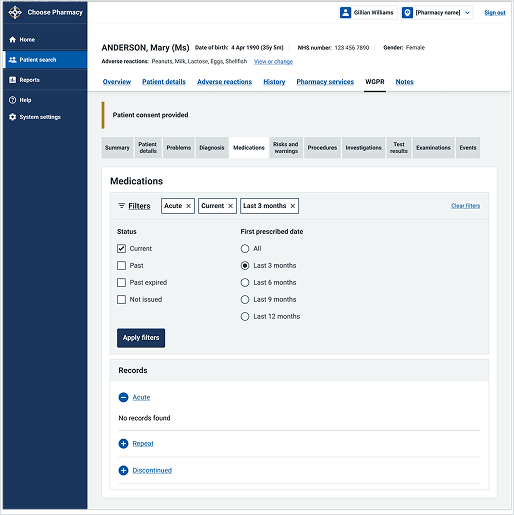
This example shows the "Medications" view within a patient's Welsh GP Record in the Choose Pharmacy service. It uses expanders under the "Records" section to organise complex medical history into collapsible categories.