Text input
Updated in October 2026
Use text input to let users enter a single line of text.
<div class="nhsw-form-group">
  <label class="nhsw-label nhsw-label--xl" for="full-name">What is your full name?</label>
  <input id="full-name" name="full-name" class="nhsw-input" type="text">
</div>
{% from "input/macro.njk" import nhswInput %}
{{ nhswInput({
id: "full-name",
name: "full-name",
label: { text: "What is your full name?", classes: "nhsw-label--xl", isPageHeading: true }
}) }}When to use text input
Use the text input component when you need users to enter text that's no longer than a single line, such as their name or phone number.
Asking 1 question per page is recommended for public-facing services. Breaking questions into smaller steps helps users:
- understand what you're asking them to do
- focus on the specific question and its answer
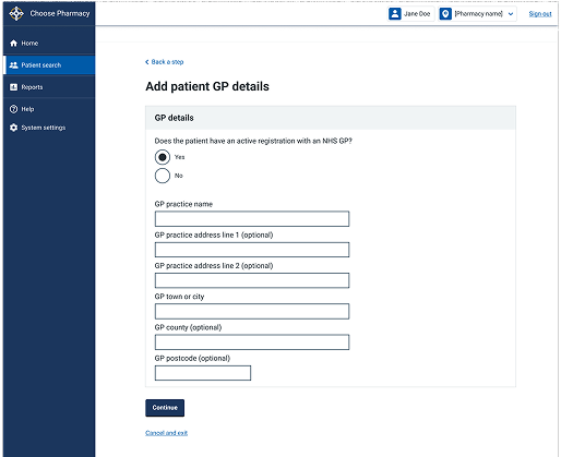
Sometimes it is more appropriate to group related questions on the same page. For example, users of clinical-facing services may need to view, compare or enter multiple pieces of information quickly.
Use research and evidence from your service to decide which approach works best for your users.
When not to use text input
Do not use this component if you need users to enter longer answers that might span several lines. In this case, use the textarea component.
How to use text input
Give the text input a label
Give it a visible label. Do not use placeholder text for a label as it vanishes when users click on the text input.
Align labels above the text inputs they refer to. Labels should be short, direct and written in sentence case. Do not use colons at the end of labels.
If you're asking 1 question on the page
<div class="nhsw-form-group">
  <label class="nhsw-label nhsw-label--xl" for="full-name">What is your full name?</label>
  <input class="nhsw-input" id="full-name" name="full-name" type="text">
</div>
{{ nhswInput({ id: "full-name", label: { text: "What is your full name?", classes: "nhsw-label--xl", isPageHeading: true } }) }}You can set the contents of the <label> as the page heading if you're asking more than 1 question on a page. This is good practice as it means that screen reader users will only hear the contents once.
Read more about Making labels and legends headings on the GOV.UK Design System.
If you're asking more than 1 question on the page
<div class="nhsw-form-group">
  <label class="nhsw-label" for="full-name">What is your full name?</label>
  <input class="nhsw-input" id="full-name" name="full-name" type="text">
</div>
{{ nhswInput({ id: "full-name", label: { text: "What is your full name?" } }) }}Do not set the contents of the <label> as the page heading if you're asking more than 1 question on a page.
Read more about Asking multiple questions on question pages in the GOV.UK Design System.
Make text inputs the right size
Help users understand what they should enter by making text inputs the right size for the information you want them to give you.
By default, the width of text inputs is fluid and will fit the full width of the container they are placed into.
If you want to make the input smaller, you can either use a fixed width input, or use the width override classes to create a smaller, fluid width input.
Fixed width inputs
<div class="nhsw-form-group">
  <label class="nhsw-label" for="fw-20">20 character width</label>
  <input class="nhsw-input nhsw-input--width-20" id="fw-20" name="fw-20" type="text">
</div>
<div class="nhsw-form-group">
  <label class="nhsw-label" for="fw-10">10 character width</label>
  <input class="nhsw-input nhsw-input--width-10" id="fw-10" name="fw-10" type="text">
</div>
<div class="nhsw-form-group">
  <label class="nhsw-label" for="fw-5">5 character width</label>
  <input class="nhsw-input nhsw-input--width-5" id="fw-5" name="fw-5" type="text">
</div>
<div class="nhsw-form-group">
  <label class="nhsw-label" for="fw-4">4 character width</label>
  <input class="nhsw-input nhsw-input--width-4" id="fw-4" name="fw-4" type="text">
</div>
<div class="nhsw-form-group">
  <label class="nhsw-label" for="fw-3">3 character width</label>
  <input class="nhsw-input nhsw-input--width-3" id="fw-3" name="fw-3" type="text">
</div>
<div class="nhsw-form-group">
  <label class="nhsw-label" for="fw-2">2 character width</label>
  <input class="nhsw-input nhsw-input--width-2" id="fw-2" name="fw-2" type="text">
</div>
{% from "input/macro.njk" import nhswInput %}
{{ nhswInput({ id: "fw-20", label: { text: "20 character width" }, classes: "nhsw-input--width-20" }) }}
{{ nhswInput({ id: "fw-10", label: { text: "10 character width" }, classes: "nhsw-input--width-10" }) }}
{{ nhswInput({ id: "fw-5", label: { text: "5 character width" }, classes: "nhsw-input--width-5" }) }}
{{ nhswInput({ id: "fw-4", label: { text: "4 character width" }, classes: "nhsw-input--width-4" }) }}
{{ nhswInput({ id: "fw-3", label: { text: "3 character width" }, classes: "nhsw-input--width-3" }) }}
{{ nhswInput({ id: "fw-2", label: { text: "2 character width" }, classes: "nhsw-input--width-2" }) }}Use fixed width inputs for content that has a specific, known length. For example, postcode inputs should be postcode-sized and phone number inputs should be phone-number-sized.
On fixed width inputs, the width will remain fixed on all screens unless it is wider than the viewport, in which case it will shrink to fit.
Fluid width inputs
<div class="nhsw-form-group">
  <label class="nhsw-label" for="flw-full">Full width</label>
  <input class="nhsw-input nhsw-input--full" id="flw-full" name="flw-full" type="text">
</div>
<div class="nhsw-form-group">
  <label class="nhsw-label" for="flw-34">Three-quarters width</label>
  <input class="nhsw-input nhsw-input--three-quarters" id="flw-34" name="flw-34" type="text">
</div>
<div class="nhsw-form-group">
  <label class="nhsw-label" for="flw-23">Two-thirds width</label>
  <input class="nhsw-input nhsw-input--two-thirds" id="flw-23" name="flw-23" type="text">
</div>
<div class="nhsw-form-group">
  <label class="nhsw-label" for="flw-12">One-half width</label>
  <input class="nhsw-input nhsw-input--half" id="flw-12" name="flw-12" type="text">
</div>
<div class="nhsw-form-group">
  <label class="nhsw-label" for="flw-14">One-quarter width</label>
  <input class="nhsw-input nhsw-input--quarter" id="flw-14" name="flw-14" type="text">
</div>
<div class="nhsw-form-group">
  <label class="nhsw-label" for="flw-13">One-third width</label>
  <input class="nhsw-input nhsw-input--third" id="flw-13" name="flw-13" type="text">
</div>
{% from "input/macro.njk" import nhswInput %}
{{ nhswInput({ id: "flw-full", label: { text: "Full width" }, classes: "nhsw-input--full" }) }}
{{ nhswInput({ id: "flw-34", label: { text: "Three-quarters width" }, classes: "nhsw-input--three-quarters" }) }}
{{ nhswInput({ id: "flw-23", label: { text: "Two-thirds width" }, classes: "nhsw-input--two-thirds" }) }}
{{ nhswInput({ id: "flw-12", label: { text: "One-half width" }, classes: "nhsw-input--half" }) }}
{{ nhswInput({ id: "flw-14", label: { text: "One-quarter width" }, classes: "nhsw-input--quarter" }) }}
{{ nhswInput({ id: "flw-13", label: { text: "One-third width" }, classes: "nhsw-input--third" }) }}Use width override classes to reduce the width of an input in relation to its parent container, for example, to two-thirds.
Fluid width inputs will resize with the viewport.
Using hint text
<div class="nhsw-form-group">
  <label class="nhsw-label" for="field">10 character width</label>
  <div class="nhsw-hint" id="field-hint">Hint text goes here</div>
  <input class="nhsw-input nhsw-input--width-10" id="field" name="field" aria-describedby="field-hint" type="text">
</div>
{% from "input/macro.njk" import nhswInput %}
{{ nhswInput({ id: "field", label: { text: "10 character width" }, hint: { text: "Hint text goes here" }, classes: "nhsw-input--width-10" }) }}You can use hint text to give users help in context, so they understand what they need to enter. For example, use it to tell users where to find information or how you will use their data. Read more about hint text.
Do not disable copy and paste
Users often need to copy and paste information into a text input, so do not stop them doing this.
Accessibility
When implemented in production, fields should identify their purpose so browsers and assistive technologies can support features such as autofill and reduce user effort. This is to support WCAG 2.2 Success Criterion 1.3.5 Identify Input Purpose, level AA.
Do not use placeholder text as a label for a text input. It disappears when users click inside the textarea and may not be announced consistently by assistive technologies. This supports WCAG 2.2 Success Criterion 3.3.2 Labels or Instructions, level A.
Associate labels programmatically with text inputs so assistive technologies can identify the purpose of each field. This supports WCAG 2.2 Success Criterion 1.3.1 Info and Relationships, level A.
Source
Learn more about Text input in the GOV.UK Design System.
Text input variants
Asking for numbers
Whole numbers
<div class="nhsw-form-group">
  <label class="nhsw-label" for="account">What is your account number?</label>
  <div class="nhsw-hint" id="account-hint">Must be between 6 and 8 digits long</div>
  <input class="nhsw-input nhsw-input--width-10" id="account" name="account" type="text" aria-describedby="account-hint" inputmode="numeric">
</div>
{{ nhswInput({ id: "account", label: { text: "What is your account number?" }, hint: { text: "Must be between 6 and 8 digits long" }, classes: "nhsw-input--width-10", inputmode: "numeric" }) }}If you're asking the user to enter a whole number, set the inputmode attribute to numeric to use the numeric keypad on devices with on-screen keyboards.
Decimal numbers
Read more about Asking for decimal numbers in the GOV.UK Design System.
Prefixes and suffixes
<div class="nhsw-form-group">
<label class="nhsw-label" for="cost">Cost per item, in pounds</label>
<div class="nhsw-input-wrapper">
<div class="nhsw-input-wrapper__prefix" aria-hidden="true">£</div>
<input class="nhsw-input nhsw-input--width-5" id="cost" name="cost" type="text" inputmode="decimal">
<div class="nhsw-input-wrapper__suffix" aria-hidden="true">Number per item</div>
</div>
</div>{{ nhswInput({
id: "cost",
label: { text: "Cost per item, in pounds" },
classes: "nhsw-input--width-5",
inputmode: "decimal",
prefix: { text: "£" },
suffix: { text: "Number per item" }
}) }}Use prefixes and suffixes to help users enter things like currencies and measurements.
Prefixes and suffixes are useful when there's a commonly understood symbol or abbreviation for the type of information you're asking for.
Do not rely on prefixes or suffixes alone, because screen readers will not read them out. Screen readers may not announce them, so you should also explain the required format in the label or hint text. For example, use the label "Cost, in pounds" alongside a £ prefix.
Position prefixes and suffixes so that they're outside of their input. This is to avoid interfering with some browsers that might insert an icon into the input, for example to show or generate a password.
Some users may not notice a prefix or suffix and include it in their answer. Your validation should allow for this and should not show an error.
Examples
Welsh Immunisation System (WIS)
This example is from the School-age Immunisations service within WIS. It shows a text input asking a parent or guardian for their full name as a single, focused question on the page.