
All components
Components are reusable parts of a user interface that have been made to support a variety of applications. Individual components can be used in multiple different pages, patterns and context.
-

Action link
Use buttons to help users carry out an action on a page like starting an application or saving their progress.
-

Back link
Use back links to help users go back to the previous page in a multi-page transaction.
-
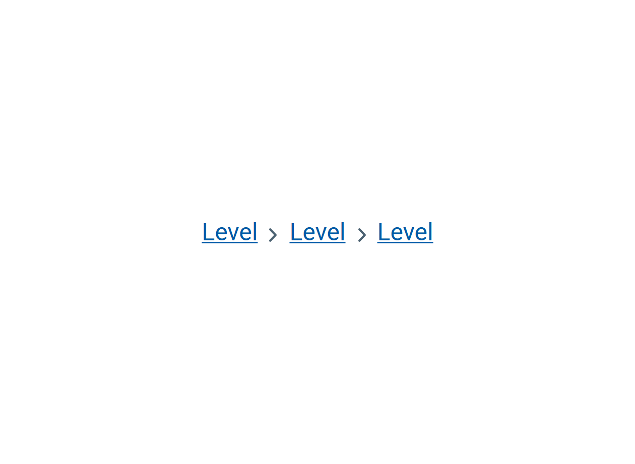
Breadcrumbs
Use breadcrumbs to help users understand where they are in the website.
-
Buttons
Use buttons to help users carry out an action on a page like starting an application or saving their progress.
-
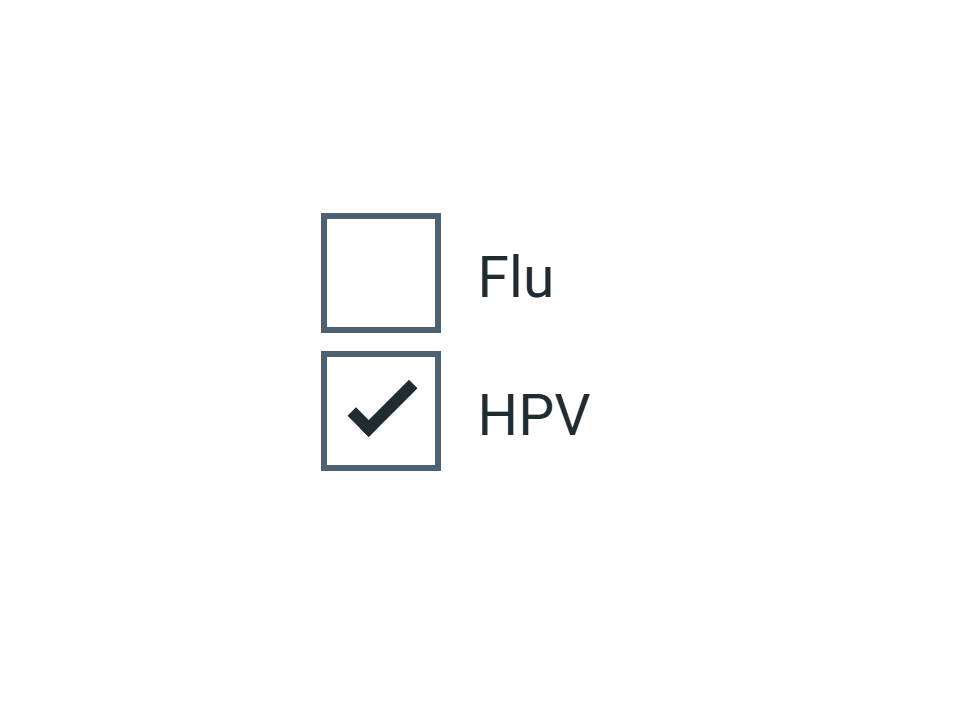
Checkboxes
Use checkboxes to let users select 1 or more options on a form.
-
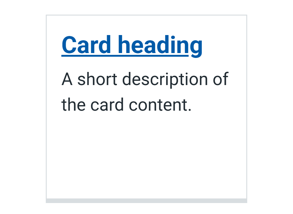
Cards
Use a card to visually group related content and actions to help users do what they need to more quickly.
-
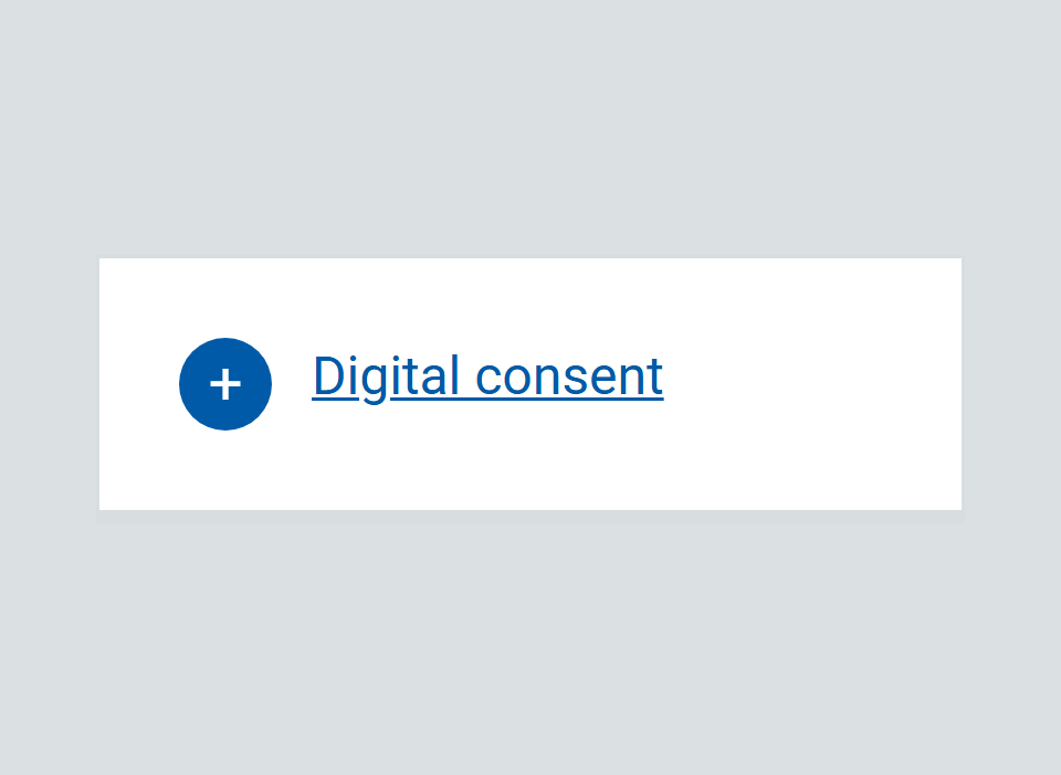
Expander
Make a complex topic easier to digest by letting users reveal more detailed information only if they need it.
-
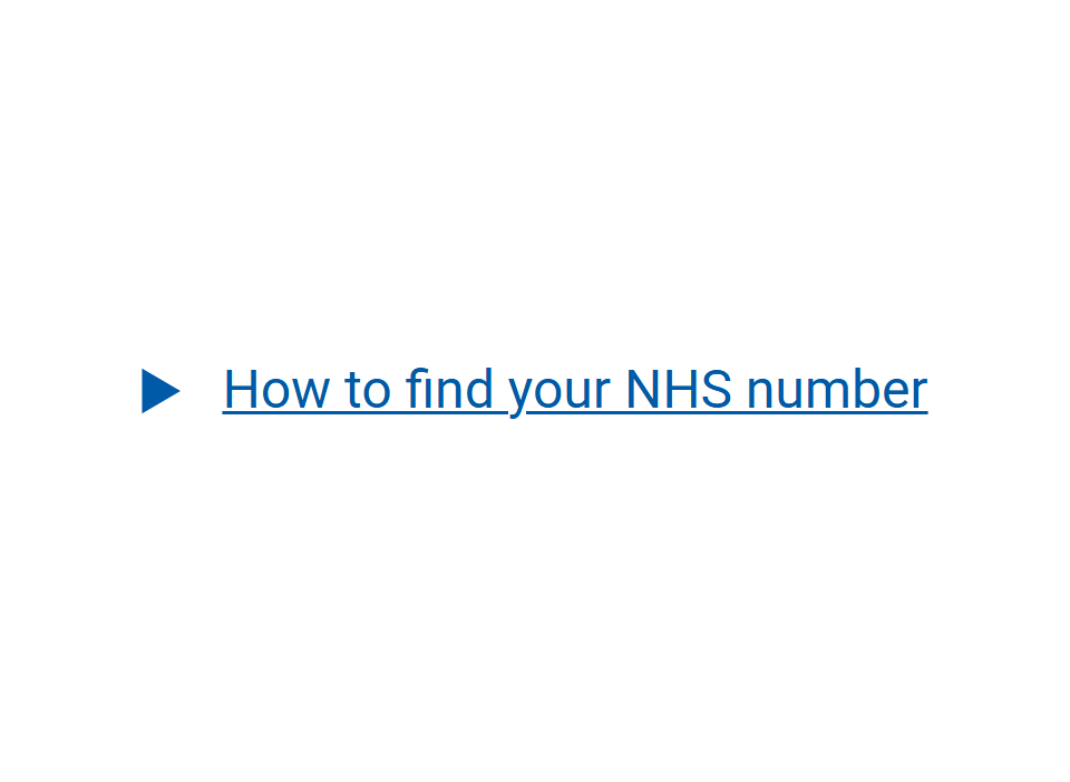
Details
Make a page easier to scan by letting users reveal more detailed information only if they need it.
-
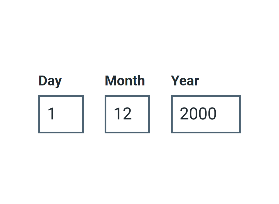
Date input
Use date input to help users enter a memorable date, like their date of birth.
-
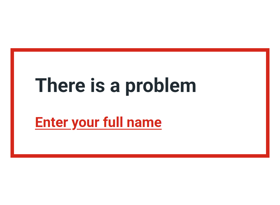
Error summary
Include an error summary at the top of a page to summarise any mistakes a user has made.
-
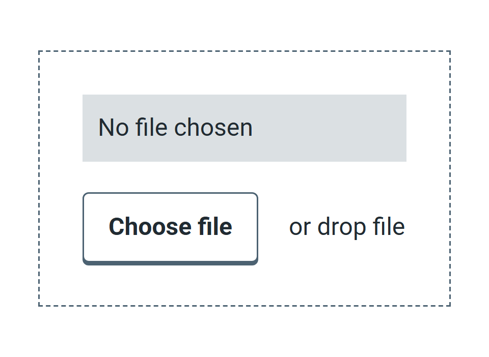
File upload
Help users select and upload a file.
-

Footer
Use the footer to show users they are on an NHS service and to help them find links they expect at the bottom of our pages.
-

Header
Use the appropriate header at the top of every page to show users they are on an NHS Wales service and help them get started in finding what they need.
-
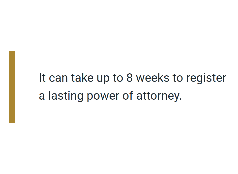
Inset text
Use inset text to help users identify and understand important content on the page, even if they do not read the whole page.
-
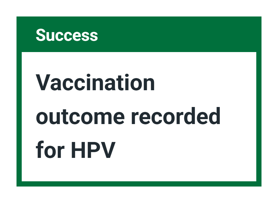
Notification banners
Use a notification banner to tell the user something they need to know that's not directly related to the page content.
-
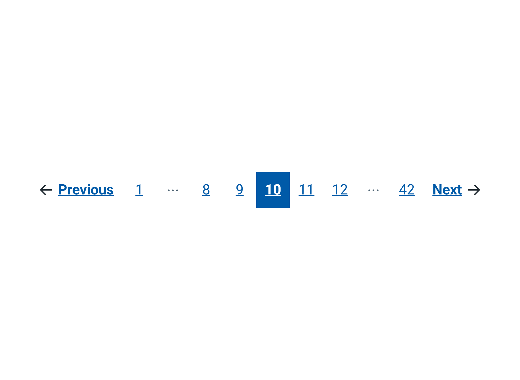
Pagination
Use pagination to help users navigate forwards and backwards through a series of pages.
-
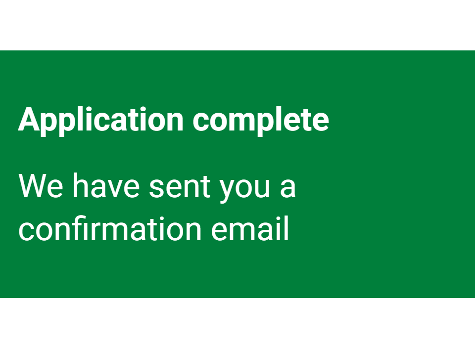
Panel
The panel component is a visible container used on confirmation or results pages to highlight important content.
-
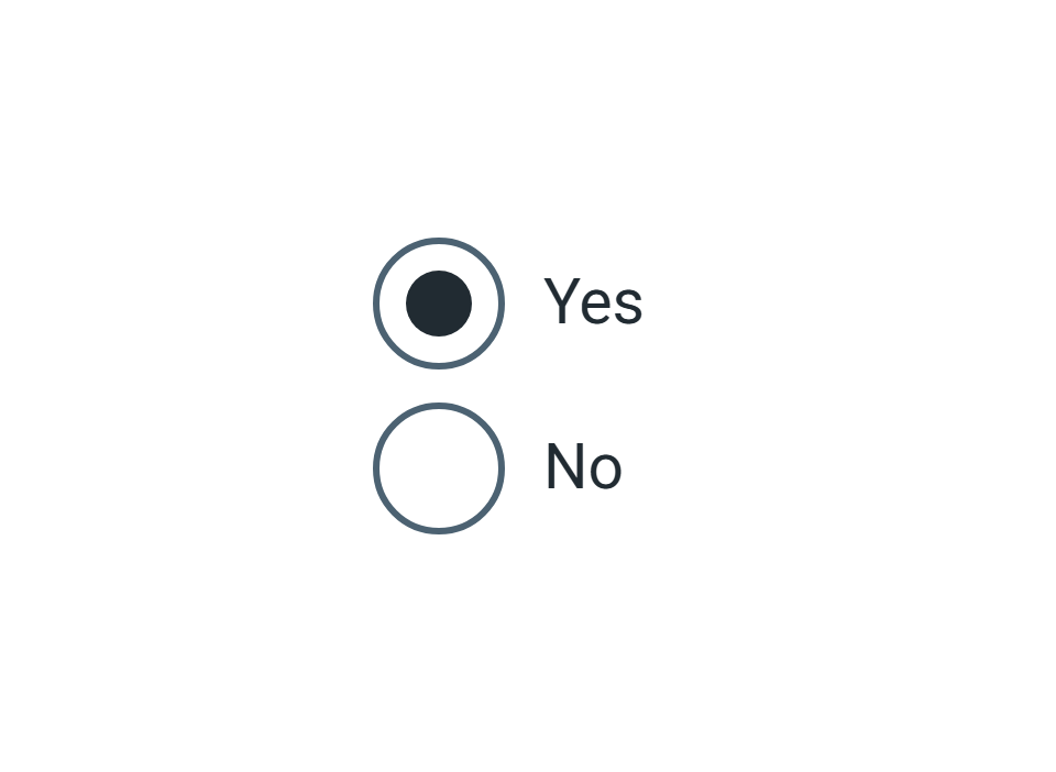
Radios
Use radios when you want users to select only 1 option from a list.
-
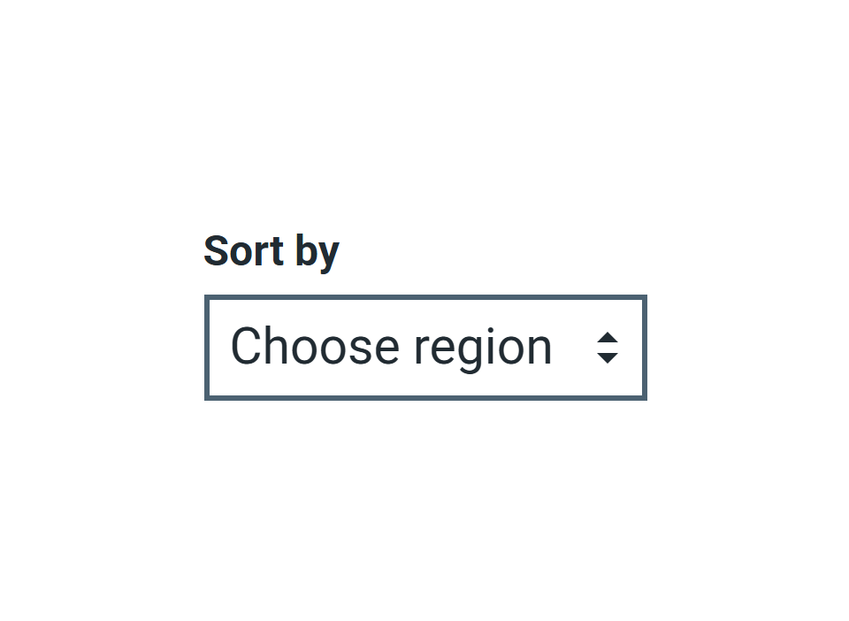
Select
Use select to let users choose an option from a long list but only use it as a last resort.
-
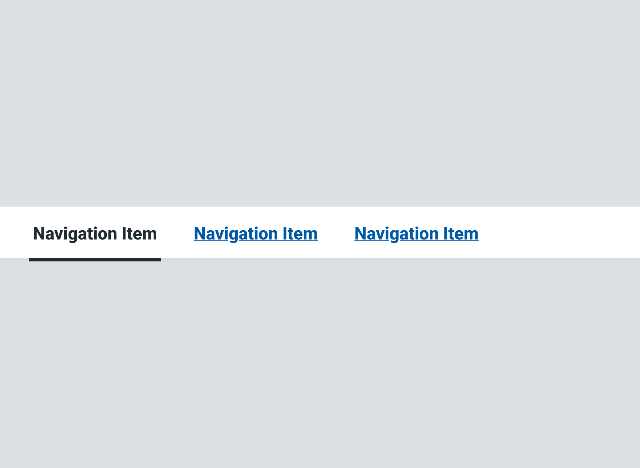
Site navigation
Site navigation gives users an overview of a site's content by outlining its main categories. It can also help users find key content.
-

Skip link
Use the skip link component to help keyboard-only users skip to the start of the content on a page.
-
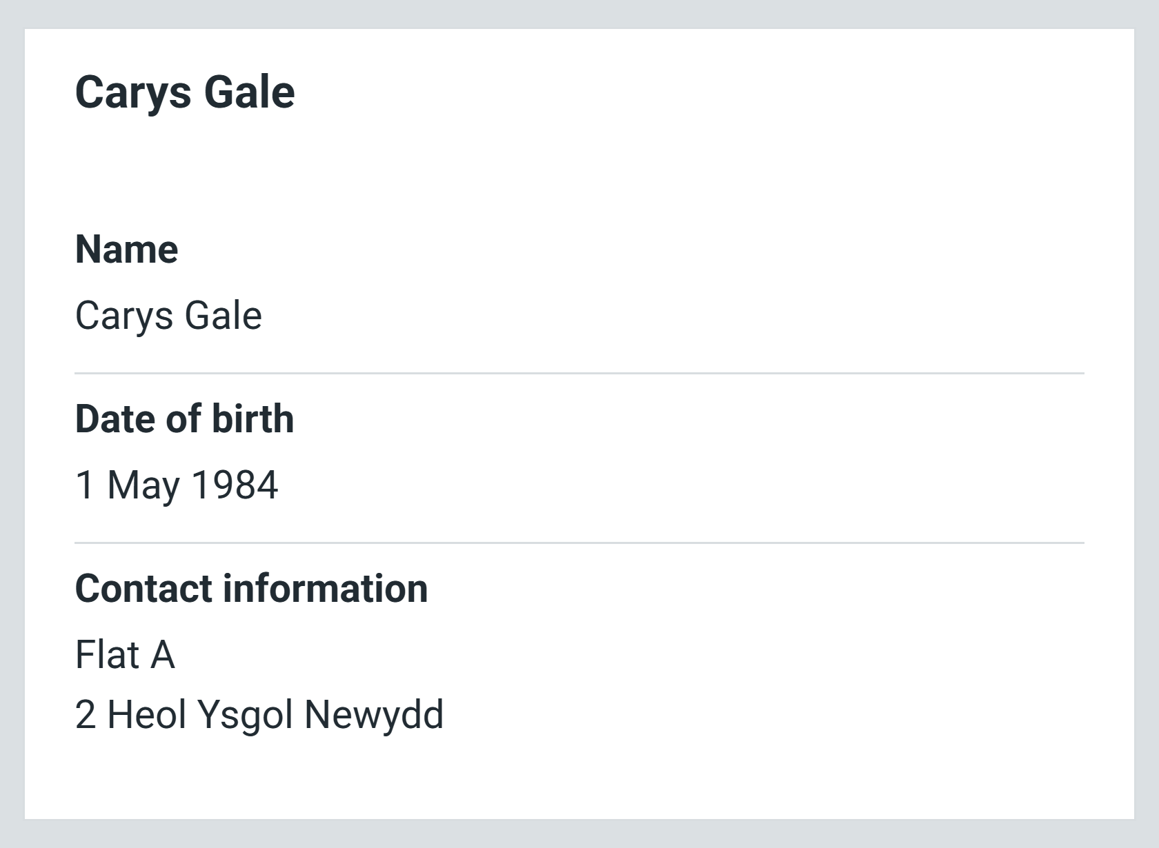
Summary list
Use the summary list to summarise information, for example, a user's responses at the end of a form.
-
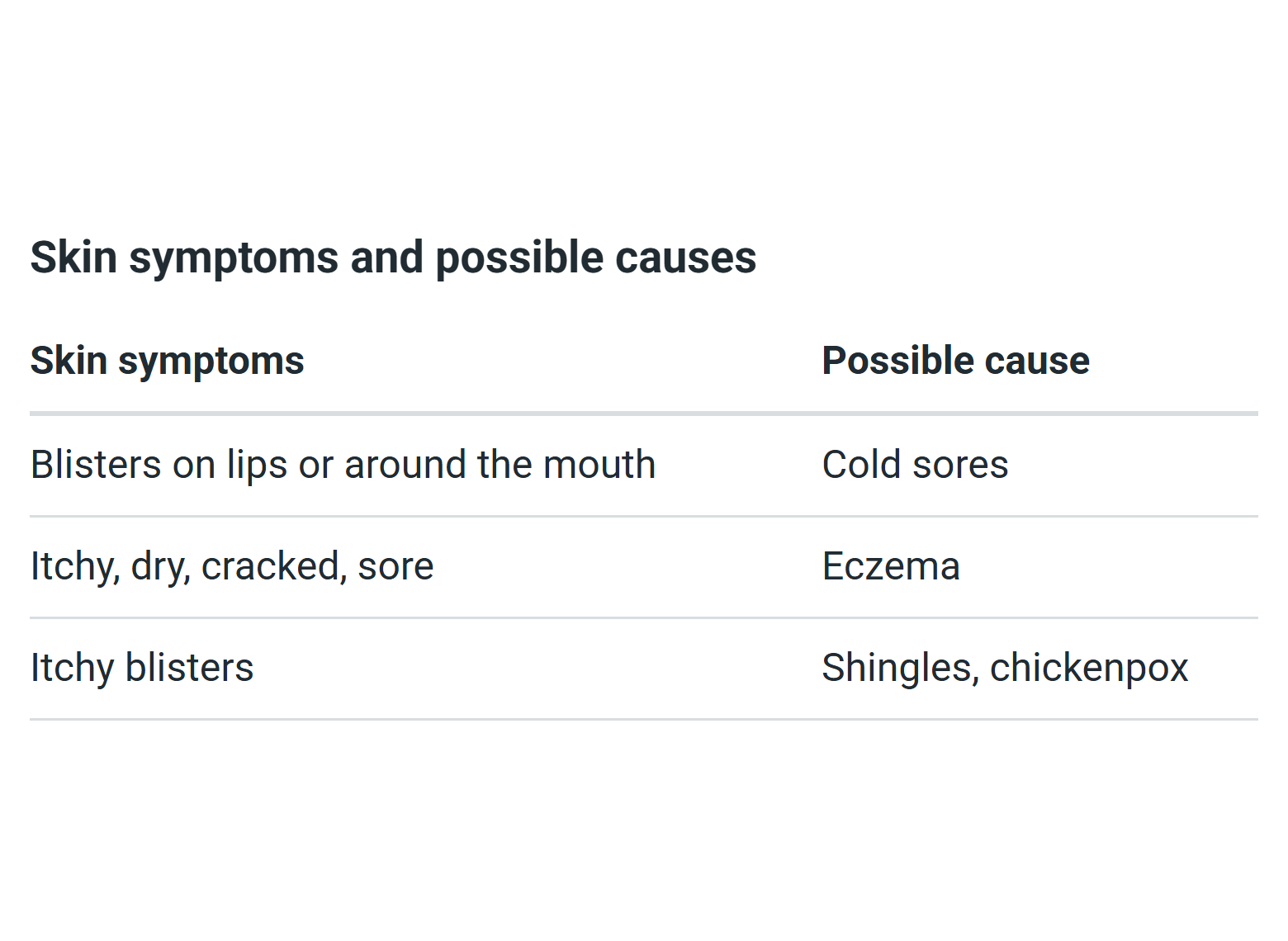
Table
Use a table to make it easier for users to compare and scan information.
-
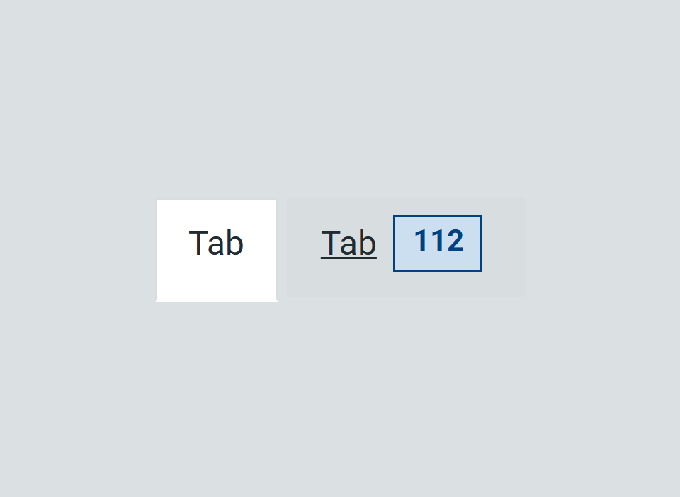
Tabs
Use tabs to let users navigate between related sections of content, displaying 1 section at a time.
-
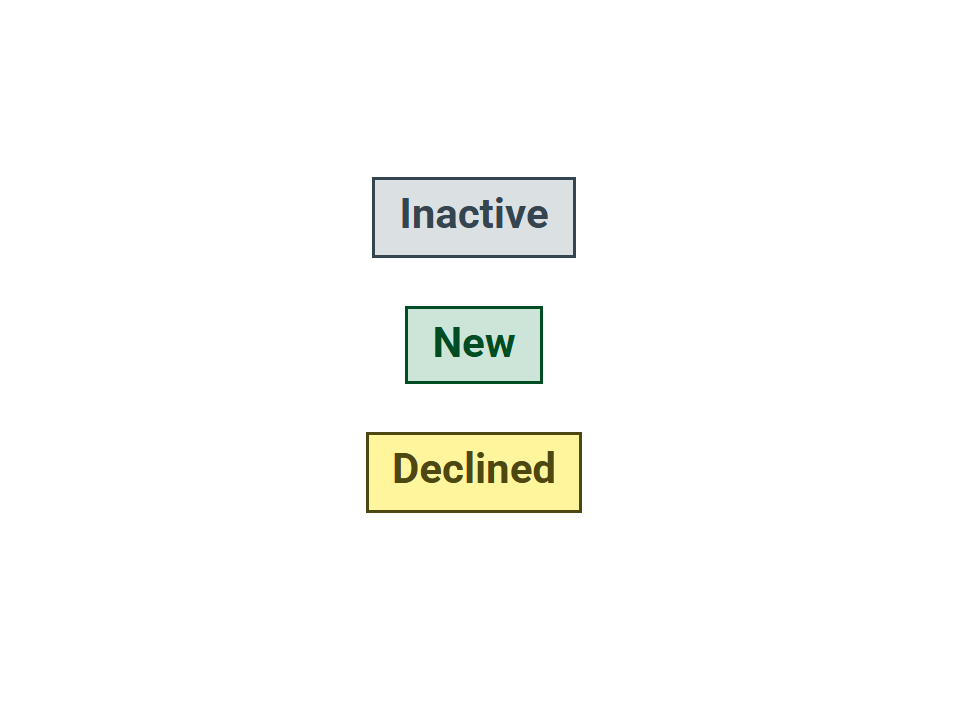
Tag
Use tag to show users the status of something.
-
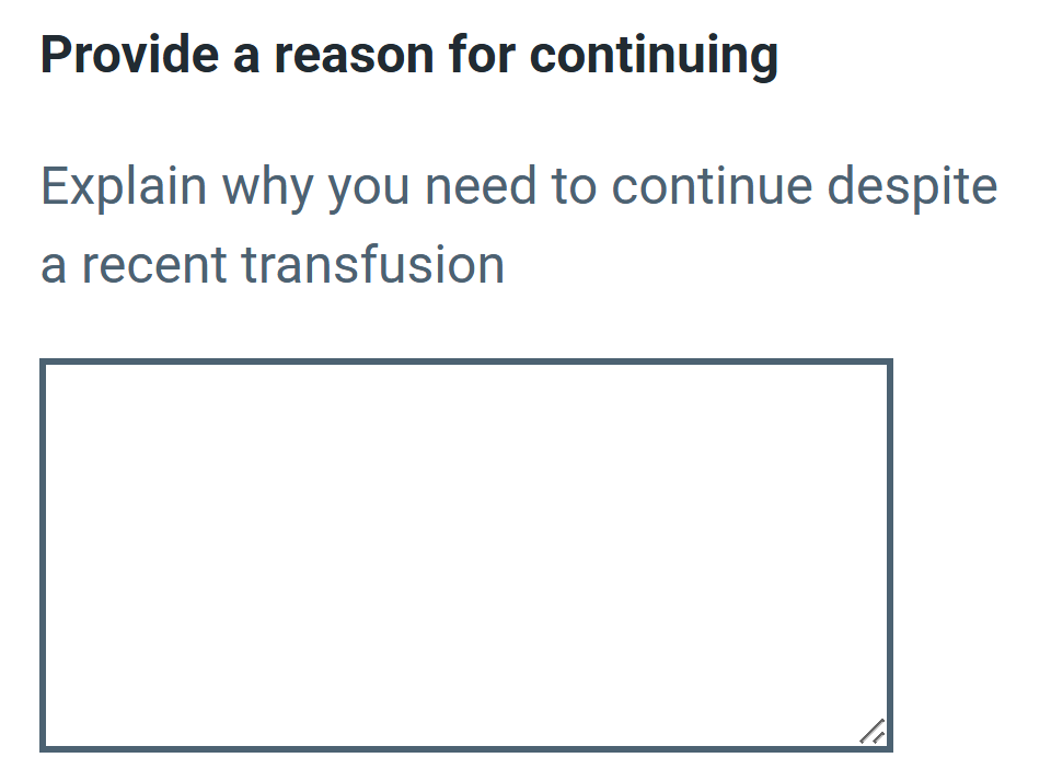
Textarea
Use textarea to let users enter more than 1 line of text.
-
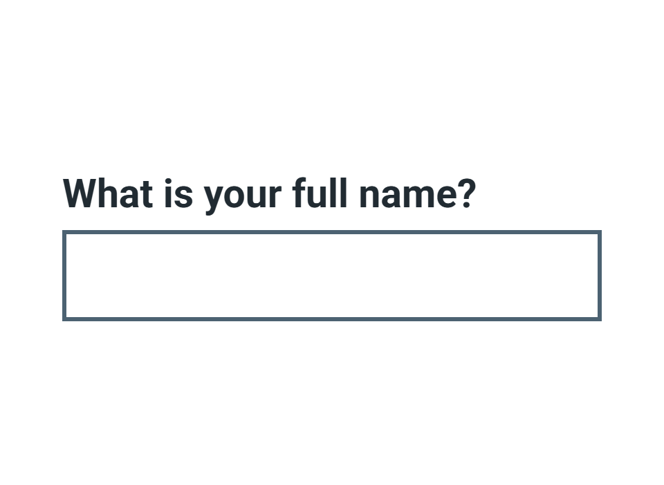
Text input
Use text input to let users enter a single line of text.
-
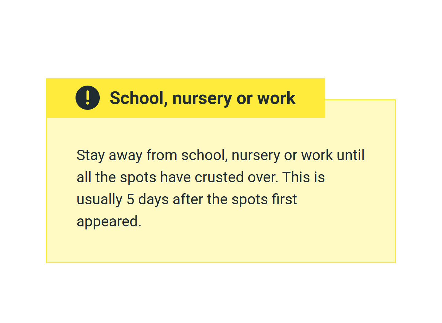
Warning callout
Use a warning callout to help users identify very important content on the page, even if they do not read the whole page.